
FEDERAL COURT OF AUSTRALIA
RB (Hygiene Home) Australia Pty Ltd v Henkel Australia Pty Ltd [2022] FCA 1042
ORDERS
RB (HYGIENE HOME) AUSTRALIA PTY LTD First Applicant RECKITT BENCKISER FINISH BV Second Applicant | ||
AND: | Respondent | |
AND BETWEEN: | Cross-Claimant | |
AND: | Cross-Respondent | |
DATE OF ORDER: | 6 September 2022 |
THE COURT ORDERS THAT:
1. The parties confer and, within 14 days of these orders, submit to the Associate to Justice Rofe an agreed minute of orders giving effect to these reasons.
2. Failing agreement, each party provide their proposed minute of orders within the same period specified in order 1.
Note: Entry of orders is dealt with in Rule 39.32 of the Federal Court Rules 2011.
ROFE J:
INTRODUCTION
1 The Second Applicant, Reckitt Benckiser Finish BV (RBF) is the owner of registered trade mark 1008914 (the 914 Mark) and registered trade mark 1211311 (the 311 Mark) (together, the Registered Marks). The First Applicant, RB (Hygiene Home) Australia Pty Ltd (RB) is an authorised user of the Registered Marks.
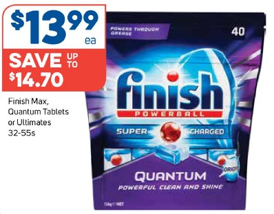
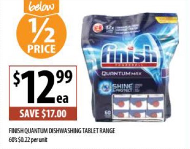
2 The Registered Marks are used by RB (and were used by its corporate predecessors) in relation to the distribution and sale in Australia of FINISH branded dishwashing capsules. The FINISH range of dishwashing capsules has been available for sale in Australia since 1999, and occupies a significant portion of the market.
3 The Respondent, Henkel Australia Pty Ltd (Henkel), owns the SOMAT brand of dishwashing products. SOMAT products have been available in various overseas markets for some years, and were first made available for purchase in Australian supermarkets in August 2021.
4 The Applicants allege that Henkel’s actual and proposed use of the following logo promoting the SOMAT Excellence Gel Caps (SE Gelcaps) constitutes trade mark infringement under s 120(1) of the Trade Marks Act 1995 (Cth) (the TMA), misleading and deceptive conduct in contravention of ss 18 and 29 of the Australian Consumer Law (the ACL) (being Schedule 2 to the Competition and Consumer Act 2010 (Cth)), and passing off:

(the SE Logo).
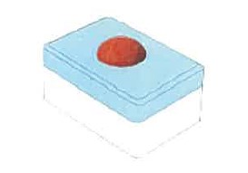
5 By way of cross-claim, Henkel applies for removal of the Registered Marks for non-use during the period from 16 July 2018 to 16 July 2021 (the relevant period).
6 On 3 September 2021, Halley J made orders restraining Henkel from offering for sale or selling dishwashing products by reference to the SE Logo, or the Registered Marks.
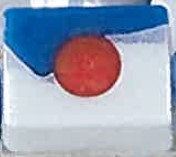
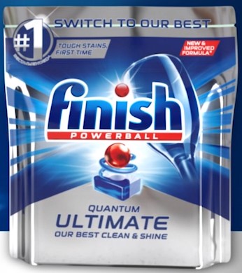
7 For the reasons below, I find that the SE Logo does not infringe either the 914 Mark or the 311 Mark. RB has also failed on its passing off and misleading and deceptive conduct cases.
8 Further, I find that RB has not used the 914 Mark or the 311 Mark during the relevant period.
EVIDENCE
9 RB relies on the following evidence:
(a) Three affidavits of Mr Sachit Barooah dated 12 August 2021 (affirmed 16 August 2021), 16 August 2021, and 24 September 2021. Mr Barooah is the Category Marketing Manager of FINISH products for RB. He has held this position since April 2021 and has been employed in other roles at RB since January 2017.
(b) Two affidavits of Mr Duncan Watson dated 12 August 2021 (affirmed 16 August 2021) and 24 September 2021. Mr Watson is the Head of Research and Development Operations Hygiene Home, Australia and New Zealand for the Reckitt Group of companies in Australia and New Zealand. Mr Watson has held various roles within the Reckitt Group for the last 21 years. In his current role, Mr Watson is responsible for research and development activities for all Home and Hygiene brands in the Australia and New Zealand market, including Finish.
(c) One affidavit of Mr Trent Kennedy dated 12 August 2021 (affirmed 13 August 2021). Mr Kennedy is the National Field Operation Manager for RB, a position he has held since May 2018. Mr Kennedy has been employed by RB in various roles since February 2005.
(d) One affidavit of Mr Peter Le Guay dated 26 August 2021. Mr Le Guay is a partner at Thomson Geer, and is the lawyer with carriage of this matter for the Applicants. Mr Le Guay gave evidence as to use of the Registered Marks during the relevant period, including television commercials, supermarket catalogues, and Amazon webpages.
(e) One affidavit of Professor Don O’Sullivan dated 24 September 2021, annexing Professor O’Sullivan’s expert report. Professor O’Sullivan is a professor of marketing at the Melbourne Business School, University of Melbourne, and has held various academic roles since 1992. Professor O’Sullivan’s evidence went to consumer behaviour. He was not instructed to consider either of the Registered Marks.
10 Henkel relies on:
(a) One affidavit of Ms Melissa Jayne Sherry dated 24 August 2021. Ms Sherry is the Marketing Lead, Australia New Zealand for the Laundry and Home Care products at Henkel. Ms Sherry has held her current position since May 2020. This is Ms Sherry’s first role at Henkel, having worked in advertising and marketing for other organisations for over 25 years. Ms Sherry was cross-examined.
(b) One affidavit of Mr Scott Hull dated 24 August 2021. Since January 2019, Mr Hull has been the General Manager, Laundry and Home Care Australia and New Zealand for Henkel. Mr Hull has over 20 years’ experience working for suppliers of fast moving consumer goods, and has worked for Henkel since September 2015. Mr Hull was cross-examined.
(c) One affidavit of Dr Karen Scheunemann dated 24 August 2021. Dr Scheunemann is the Corporate Senior Legal Counsel for Henkel AG & Co KGaA (Henkel AG) and is based in Düsseldorf, Germany. Dr Scheunemann was cross-examined via video link.
(d) One affidavit of Ms Anita May Cade dated 13 October 2021. Ms Cade is a partner at Ashurst Australia and the lawyer responsible for the carriage of the matter on behalf of Henkel. Ms Cade gave evidence of her visit to the Amazon website and navigating around the section of that site offering FINISH products for sale.
(e) One affidavit of Professor Jill Gabrielle Klein dated 13 October 2021. Since 2009, Professor Klein has been a professor of marketing at the Melbourne Business School, University of Melbourne. Since 2015, she has held dual roles as a Professor in the Melbourne Business School and as a Professorial Fellow at the Melbourne Medical School. Professor Klein was awarded her PhD in Social Psychology from the University of Michigan in 1990. Professor Klein has lectured, published and conducted research in relation to consumer behaviour including consumer perceptions, impression formation and decision-making.
(f) One affidavit of Mr Paul Lindsay Blanket dated 13 October 2021. Mr Blanket holds a Bachelor of Commerce Degree (Marketing) and a Master of Commerce Degree (Marketing) from the University of New South Wales. He has completed additional programs in management and advertising run by the University of Melbourne and the Massachusetts Institute of Technology. Mr Blanket is also a Fellow of the Australian Marketing Institute and has gained Certified Practising Marketer status. He lectures in advertising and marketing at Macquarie Graduate School of Management.
Mr Blanket is the Principal of First Impressions Pty Ltd, a company established in 1987 and engaged in the business of providing marketing, advertising and promotional consulting services to government and industry clients. Prior to founding First Impressions, Mr Blanket worked as a Group Account Director in an advertising agency, and before that he was employed in marketing roles with a number of commercial enterprises. Mr Blanket has over 30 years’ experience in developing brand names, product logos, packaging designs and advertising campaigns, including for fast moving consumer goods such as those sold in supermarkets.
11 The parties’ experts (Professor O’Sullivan, Professor Klein, and Mr Blanket) prepared a joint expert report, and gave evidence in person by way of a concurrent evidence session.
BACKGROUND
Reckitt Benckiser and the FINISH products
12 The Applicants are both part of the Reckitt Benckiser group of companies, being a group of companies ultimately owned by Reckitt Benckiser Group PLC. The Second Applicant, RBF, is a company incorporated in the Netherlands and the owner of the Registered Marks. The First Applicant, RB, was incorporated on 22 October 2018, and is authorised to use the Registered Marks.
13 Prior to RB’s incorporation, Reckitt Benckiser (Australia) Pty Ltd (RBA) was authorised to use the Registered Marks and carried out the same business as RB. Unless the context requires otherwise, I will refer to RB throughout these reasons regardless of the relevant entity at the time.
14 RB currently imports, markets and sells a range of dishwashing products in Australia under the FINISH brand.
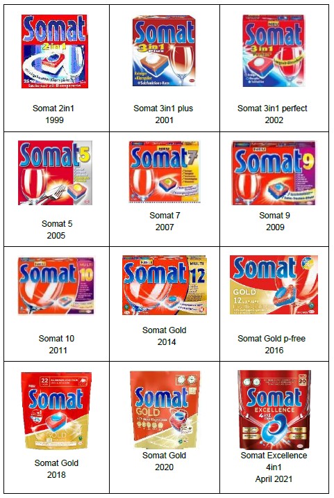
15 FINISH dishwashing products were first sold in Australia in 1964. Since then, FINISH products have been sold continuously, with the range being updated from time to time with new or improved products.
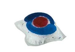
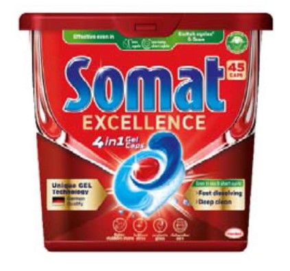
16 FINISH products have a significant market share of the dishwashing market in Australia, with over 60% share of the market including both powder and capsule form. In this judgment I will use the term dishwashing capsules to encompass all dishwashing products sold in either tablet, capsule or gelcap form.
17 FINISH is a well-known and recognisable household brand in Australia. As at July 2021, FINISH has 63% of the dishwasher capsule market in Australia.
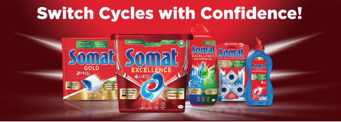
18 RB spends a large amount on media advertising for its FINISH capsule products. The advertising includes television commercials, online platforms, billboards, and supermarket catalogues.
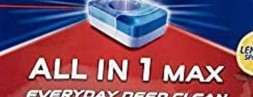
19 Since approximately 1999, RB has sold a two-tone (white and blue) hard-pressed dishwashing capsule in Australia (FINISH Tablet). The FINISH Tablet has a protruding red “Powerball” and is pictured below. A tablet of this kind is used in the FINISH All in 1, the FINISH All in 1 Max, and FINISH Classic products. A representation of the FINISH Tablet appears below:
20 The constituents of the FINISH Tablet are naturally colourless, or in some cases white or yellow-ish. The red and blue colours were chosen for aesthetic reasons; they do not serve or provide any functional or performance benefit. Aside from the need to fit within the dishwasher tablet dispenser, there is no functional basis for the FINISH Tablet shape or the positioning of the components within the Tablet.
21 Since approximately 2007, RB has sold a three-coloured gelcap in Australia (FINISH Gelcap). The FINISH Gelcap consists of the colours white and blue, with a red Powerball. This design is used for the FINISH Quantum and FINISH Quantum Ultimate products. Again, there is no functional basis for the placement of the components or their colouring. The colours and shape serve a purely aesthetic purpose. A representation of the FINISH Gelcap appears below, as well as a photograph of a FINISH Quantum product:

22 The FINISH range of dishwashing capsules is not limited to the Tablet and Gelcap pictured above, or to the red, white and blue colours.
23 There were several different examples of FINISH dishwashing capsules and their packaging in evidence. The evidence included both physical exhibits and pictures of the various products annexed to affidavits. Below is a summary of the FINISH dishwashing capsule products.
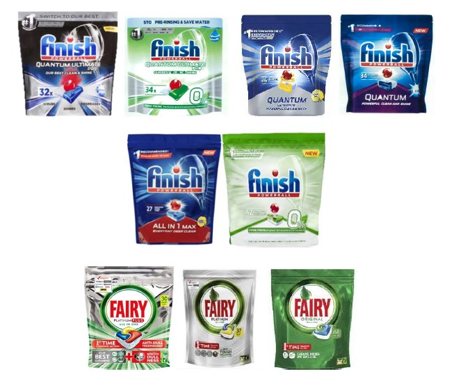
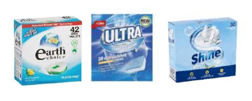
Product name | Colours | Capsule type |
FINISH Classic | White and blue with red Powerball | Tablet |
FINISH All in 1 | White and blue with red Powerball | Tablet |
FINISH All in 1 (Lemon Sparkle) | White and blue with red Powerball | Tablet |
FINISH 0% | White and green with red Powerball | Tablet |
FINISH All in 1 Max | White and blue with red Powerball | Tablet |
FINISH Quantum | White and blue with red Powerball | Gelcap |
FINISH Quantum Ultimate | White and blue with red Powerball | Gelcap |
FINISH Quantum Ultimate (Lemon Sparkle) | White and yellow with red Powerball | Gelcap |
FINISH Quantum Ultimate Pro | Speckled white and blue with red Powerball | Other capsule |
FINISH Quantum Ultimate Pro 0% (free from perfume) | White and green with red Powerball | Other capsule |
FINISH Quantum Ultimate Pro (Lemon Sparkle) | Speckled white and yellow with red Powerball | Other capsule |
24 Each of the varieties listed above are contained in foil packaging, bar the FINISH All in 1 and FINISH All in 1 (Lemon Sparkle) products, which are contained in cardboard boxes.
25 There are several key elements on FINISH packaging that remain relatively constant throughout the range.
26 Each variety of the Finish capsule packaging has the FINISH POWERBALL Logo featuring prominently at the top. This logo contains the work FINISH in dark blue text with a white border. The dot over the “i” is a red ball. Underneath the word FINISH is the word POWERBALL in upper case white font on a red background:
(the FINISH POWERBALL Logo).
27 The centre of each package design features a stylised depiction of the particular dishwashing capsule found in the package. Below are examples from the FINISH All in 1 and the FINISH Quantum Ultimate products:

28 The central stylised product depiction on the FINISH packaging varies across the range: for example, whether the product is a tablet or gelcap; the angle of the tablet; the components of the capsule; the colours of the components; the presence or absence of a swirl; and the extent to which the red ball is embedded in or floating above the capsule.
29 In addition to the FINISH POWERBALL Logo, the packaging will often have other words prominently displayed (such as QUANTUM or QUANTUM ULTIMATE), which can be described as sub-products. This sub-product text may appear directly below the FINISH POWERBALL Logo (as in the FINISH Quantum Ultimate Pro product), or at the bottom of the package beneath the stylised product image (as in the FINISH All in 1 Max product):

30 The FINISH packaging is cluttered with other words, phrases and pictures, which vary based on the sub-product. Examples include imagery of lemons for lemon-scented products; and phrases such as “powerful clean & shine”; “#1 recommended”; “tough stains, first time”; “our best clean & shine”; “with ACTIVBLU technologyTM”; and “stop pre-rinsing & save water”.
31 Finally, each packaging design features an image of a large wine glass on a 45-degree angle in the right half of the packages.
The Registered Marks
32 The 914 Mark is a colour and shape mark, comprising a rectangular tablet with a red ball and blue wave:
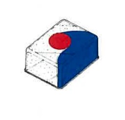
33 The 914 Mark is registered in respect of goods in Classes 1 and 3 including bleaching preparations and other substances for dishwashing, whether or not in solid, fluid or gel form; and dishwasher cleaner, freshener and deodoriser in gelcap form.
34 The 914 Mark contains an endorsement which states that:
The trade mark consists of the shape and colour of the goods as depicted in the representation attached to the application form, namely, a rectangular shaped capsule with rounded corners; the capsule has a RED cylindrical compartment embedded in the capsule; the RED centre is partly encircled by a BLUE portion of the capsule resembling a wave; the BLUE wave portion of the capsule is made of a gel substance; the remaining portion of the capsule consists of multi coloured granules of powder.
35 The 914 Mark has a priority date of 6 January 2004.
36 The 311 Mark is an image featuring a red ball in a white “explosion” against a blue backdrop, as depicted below:

37 The 311 Mark is registered in respect of goods in Class 3 including bleaching preparations and other substances for dishwashing; dishwashing preparations; dishwasher cleaner, freshener and deodoriser; and rinsing agents. Unlike the 914 Mark, the 311 Mark is not registered in Class 1 and there is no endorsement to the mark.
38 The 311 Mark has a priority date of 21 November 2007.
Henkel and the SOMAT products
39 Henkel is part of the global Henkel group of companies (as is Henkel AG). Henkel imports, markets and sells a diverse range of consumer and industrial goods in Australia, including laundry and home care goods.
40 Henkel has operated a “Laundry and Home Care” business unit in Australia since 2015, when Henkel acquired a number of Australian and New Zealand laundry brands from Colgate-Palmolive, including COLD POWER, DYNAMO, and FAB. Other Henkel business units (namely, the “Adhesive Technologies” and “Beauty Care” units) have operated in Australia for over 35 years.
41 Henkel AG has offered SOMAT branded dishwashing detergents for sale in Europe for over 50 years. SOMAT products have been available for purchase by consumers in Germany since approximately 1962.
42 SOMAT is now the market-leading brand of automatic dishwashing cleaning products in Germany, with a market share in 2020 of 34.4%. SOMAT also has large shares of the market for automatic dishwashing cleaning products in Russia, Spain, Austria and Poland.
43 In about 1999, Henkel AG introduced the SOMAT branded dishwashing products in tablet form in Germany.
44 The colour red and the SOMAT brand have been prominently used on the packaging of SOMAT dishwashing capsules since their launch in 1999. The colours red and blue have always been a part of the design of SOMAT dishwashing capsules. Dr Scheunemann annexed the table below to her affidavit, showing different examples of SOMAT capsule packaging since 1999.
45 Henkel AG launched the SE Gelcaps in Germany and Switzerland in approximately April 2021. Subsequently the SE Gelcaps have launched in other European countries including Austria, Poland, Russia, Italy and Spain. Below is a picture of a SE Gelcap.
46 Henkel sought to launch the SE Gelcap in Australia in August 2021. However, RB obtained an interlocutory injunction stopping Henkel from offering for sale, selling and supplying SE Gelcaps in Australia: see RB (Hygiene Home) Australia Pty Ltd v Henkel Australia Pty Ltd [2021] FCA 1094.
47 The SOMAT automatic dishwasher product range also includes SOMAT Gold Gelcaps, which are not the subject of this proceeding, as well as SOMAT Excellence Duo Power Gel, SOMAT Gold Power Gel, SOMAT Rinser and Drying Booster and SOMAT Machine Cleaner. Mr Hull described the SE Gelcaps as the “super premium” offering in the range. The SE Gelcap is at the top of the range both in terms of price and performance. The SE Gelcaps are targeted to the premium capsule shopper, while the SOMAT Gold Gel Caps are aimed at mainstream capsule shoppers. The below image (originally annexed to the Sherry affidavit) shows some of the different products available under the SOMAT brand.
48 The SE Gelcaps are provided in a plastic tub (see image below). This is the first dishwashing capsule to be offered for sale in a plastic tub in Australia.
49 Prior to launching, in June 2019, Henkel filed two Australian Design registration applications in respect of the shape of the SE Gelcap.
Retail sales of dishwashing products
50 The following is taken from the expert and lay evidence.
51 Automatic dishwashing detergent products come in three forms: tablets, capsules, or gelcaps (which I refer to collectively as capsules, unless necessary to distinguish), powders and gels.
52 Automatic dishwashing detergent products are predominantly sold in supermarkets such as Coles, Woolworths, and IGA. The products are also sold in other retailers such as Big W and The Reject Shop; and online at websites including Amazon and the Coles and Woolworths online shops. All the evidence as to physical displays and consumer purchase behaviour related to the sale and display of dishwashing detergent products in supermarkets.
53 The dishwashing capsule market is a brand heavy sector in which consumers are focussed on brand products. FINISH is the dominant market leader in the dishwashing capsule market and has been for many years. It has around 63% of the market. FAIRY is the other major brand. Together FINISH and FAIRY account for approximately 90% of the dishwashing capsule market. The remaining 10% of the market is taken up by other brands including EARTH CHOICE, the LOGIX brand sold by Aldi, Coles’ home brand ULTRA, and Woolworths’ home brand SHINE.
54 The products of the main players are packaged in foil packaging. The EARTH CHOICE products are sold in cardboard boxes, while the SHINE, ULTRA and LOGIX products are sold in both foil packaging and cardboard boxes.
55 The capsules of the FINISH and FAIRY brands vary in price, although the evidence showed that there was frequent discounting and that usually one variety of capsules from one brand is on sale in the major supermarkets at any time.
56 Blocks of each brand’s dishwashing products are located together on the supermarket shelves. The bulk of the products are capsules, but there are also machine cleaners and liquids. The capsule products occupy most of the shelf space.
57 Each capsule product has the brand name displayed prominently on the front of the package. For each brand, the brand name is highly visible. It is in the top third of the package and easily seen as it is written in large font that contrasts against the background and is thus easy to read. In the case of FINISH, the brand name is in blue writing surrounded by a white outline. In the case of FAIRY, the writing is red on a white background.
58 It is common to the trade to display stylised product depictions on the front of the packaging to distinguish between the varieties of dishwashing capsule within the brand range. Each brand (including the home brands) displays a stylised picture of the capsule found inside the packaging centrally on the front of the packaging.
59 It is also common in the trade that the top of the range capsules of a brand have more components than those capsules lower in the range. For example, the FAIRY Platinum and FAIRY Platinum Plus Expert capsules each have four components; whereas the FAIRY Original capsules have three. The consumer can see the number of components in the stylised product depiction on the front of the packaging.
60 The packaging of the major brands’ dishwashing capsules was described by the experts as “cluttered”. By way of example, Mr Blanket identified some 18 visual elements on the packaging of the FINISH Quantum Ultimate Pro packaging. The packaging for each follows a similar form. Both FAIRY and FINISH:
(a) use similarly sized foil packaging for their dishwashing tablets;
(b) prominently display the brand name in logo format on the front of the packaging;
(c) use words such as “Quantum” or “Platinum” to describe the sub-product, usually placed prominently just under or near the brand logos;
(d) use a stylised depiction of the capsule product on the front of the packaging;
(e) have laudatory epithets or call outs such as “anti-dull technology”, “our best cleaning”, “#1 recommended”, “all in one” covering much of the rest of the front of the packaging, these call outs differing between the various sub-products;
(f) have the number of capsules in the package written on the front; and
(g) adopt consistent colour schemes for the packaging of their varieties of tablets (neither using red for the background colour or gold for the text):
(i) FAIRY packaging is predominantly green and silver; and
(ii) FINISH packaging predominantly uses a blue and silver colour scheme, but with other colours to denote variants: black, red, yellow, or purple, or green and silver for products which claim environmental benefits;
Consumer behaviour and cues
61 The following is taken from the evidence of Professor O’Sullivan, Professor Klein and Mr Blanket.
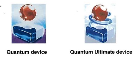
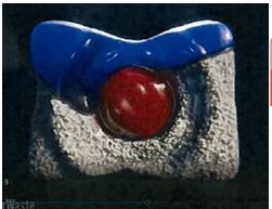
62 The experts agreed that the category of dishwashing products was a “low involvement” category (relative to many other purchases such as appliances or clothing) in which consumers spend relatively little time studying the product packaging. The experts observed that among supermarket products detergents generally rank low on involvement for many consumers, lower than for example, shampoo or toothpaste. The experts considered that dishwashing capsules are likely to be similar to detergents in this regard although they noted that the relatively higher price of the capsule products may make involvement higher than for detergent.
63 Consumers purchase dishwashing capsules occasionally (once in several weeks) but they use the capsules much more frequently, perhaps daily. Consumers see the front of the package on use as well as the tablet. If the dishwashing capsules are stored under the sink, the consumer is likely to view the brand logo at the top third of the packaging, rather than the lower down stylised product depiction.
64 Even for low involvement supermarket products such as dishwashing products, the experts agreed that consumers are likely to be motivated to select their preferred product. The consumer comes to the supermarket already determined to buy a dishwashing product, perhaps with a product of a particular brand in mind, or a shortlist of products.
65 All dishwashing capsules are found together in the same section of the supermarket. A consumer wishing to purchase dishwashing capsules will first seek out where that category of goods is located within the store.
66 For a low involvement product such as dishwashing capsules, consumers are unlikely to lift up the different packages from the supermarket shelves and examine or compare them as part of the decision making process.
67 In the shopping context when consumers are searching for particular types and brands of products they use visual stimuli to help them categorise a product as being of a particular product type or brand. Consumers use cues to help them find products in busy environments. The cues differ in their ability to correctly assign an object to a category. A cue with a high degree of ability to correctly assign an object is known as a “diagnostic” cue. In the context of brand recognition, a perfectly diagnostic cue will allow a consumer to identify a product as belonging to a particular brand each and every time. Professor Klein gave the example of COCA-COLA or PEPSI as being perfectly diagnostic cues of the brand of cola product.
68 Brand names, colours, typefaces and layout, graphics and imagery, and package shapes and formats all may, in a given circumstance, play a role in allowing a consumer to identify a branded product.
69 However, the consumer’s visual diagnostic system is set up to use the most diagnostic cue available. This is typically the brand name.
70 Faced with multiple cues, consumers tend to place greater weight on cues that they perceive to be more useful in differentiating between brands and products from different brands. Consumers rely on the fewest possible cues, as few as one or two, to make their decision. When multiple cues are available people seeking to categorise objects focus on the most diagnostic cue available.
71 The experts agreed that generally, the brand name is the most diagnostic cue for identifying one’s preferred brand. Other cues may be pictures of the product, the colour of the packaging, brand variants, and pack size.
72 The experts agreed that consumers will select a dishwashing capsule using only one or two cues, very rapidly (in the order of 2–3 seconds), and after examining a very small number of products. The utility of a brand element in cueing the brand is dependent on the element being readily identifiable and unique to the brand.
73 When a cue is used by multiple brands within a category, and is thus not unique, it has less utility as a cue that products come from a specific brand. Customers will not typically scan the shelves for such an element.
74 Cues which are common to the packaging of FINISH and other dishwashing capsule packaging include the brand name (on all packaging), a depiction of the product (on all packaging), streaks of light (also found on FAIRY, LOGIX and SOMAT packaging), a depiction of a wine glass (also found on SHINE, LOGIX and SOMAT packaging), and references to “new” or “best” (also found on FAIRY, LOGIX and EARTH CHOICE packaging).
75 As a low involvement and fairly frequent purchase, consumers will typically arrive at the supermarket with a specific brand or brands in mind (ie, a FINISH capsule product and/or a FAIRY capsule product) as part of a semi-fixed decision rule (ie, buy any brand I recognise; buy a specific brand; buy the cheapest of a predetermined set of brands).
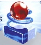
76 Consumers of packaged goods sold in supermarkets are highly responsive to sales promotions and respond in large part by switching between variants of the same brand or between brands in response to sales promotions. Professor O’Sullivan’s evidence was that a large percentage of sales of detergent products come off sales promotion. The supermarket catalogues in evidence show that in each catalogue at least one of the FINISH or FAIRY products is usually on sale. The depth of discounting can be substantial, up to 50% off the usual price. Where the consumer views products as being functionally equivalent and prices vary significantly over time, it is rational for consumers to give the bulk of their fleeting attention to price information.
77 The experts identified, or were asked to consider, several classes of consumer looking to purchase from the major brands of dishwashing capsules. The level of each hypothetical consumers’ “involvement” in the purchase would impact the likelihood of confusion.
(a) A loyal or “welded on” consumer who specifically wants, for example, a FINISH QUANTUM ULTIMATE PRO product. Professor O’Sullivan’s evidence was that such a consumer would take more than a cursory look at the shelf, as the risk of mis-purchase was high for such a customer (and therefore the risk of confusion low).
(b) A consumer who tends to buy FINISH products but will move between various sub-brands depending on factors like discounting.
(c) A “repertoire shopper” consumer who is open to purchase a product from a range of familiar brands, for example either FINISH or FAIRY. Again, selection will likely be impacted by factors like discounting.
(d) A “forgetful shopper” consumer who is looking to replenish the FINISH tablets they have at home but who cannot recall the name FINISH. This hypothetical consumer is, however, able to recall what the product looks like as they have handled the product itself when putting it into the dishwasher.
78 The experts were in agreement on many issues. The main area of disagreement was as to the primacy of brand or imagery as the diagnostic cue (particularly in the case of the hypothetical forgetful shopper).
79 Professor Klein and Mr Blanket agreed that, when searching for a FINISH dishwashing capsule product, the brand name would be the most important cue for consumers. On the other hand, Professor O’Sullivan’s opinion was that consumers are likely to rely on the red ball in relation to the capsule as a visual cue to identify the FINISH products.
80 Professor O’Sullivan’s evidence was that brand names are neither efficient nor sufficient cues for consumers seeking a specific product, and the image is an efficient clue for such consumers. The brand name extends beyond the capsule products, as do the other packaging elements such as dominant pack colour and in his opinion this does not allow the consumer to zero in on the goal with which many enter the store: to replenish the stock of a tablet that they regularly use.
81 In Professor O’Sullivan’s opinion, the consumer would use the central image as the dominant cue when searching for the FINISH capsule. It was clear that Professor O’Sullivan regarded the red Powerball — either embedded in or elevated above the capsule — as the highly distinctive element of the central image on the FINISH packaging, not the totality of the red ball with the predominantly white tablet with blue wave form, or with a blue and white gelcap. In the joint report Professor O’Sullivan noted that in his opinion “consumers are likely to rely on the image of the red ball in relation to the tablet when searching for Finish Tablet products. The image is uniquely a feature of the Finish tablet range and features prominently on the packaging”. He challenged Professor Klein in the joint session:
So the fact that there’s a red ball, a relatively large red ball prominent in that it’s in the middle of the packaging and that’s common to all variants in the tablet range, you still don’t think that they would rely on that as a cue when selecting, when searching for Finish tablet products?
82 In Professor O’Sullivan’s opinion, where the FINISH brand is also used on products other than dishwashing tablets, such as rinse aid and other detergents, the brand was not a sufficient cue for a consumer seeking a FINISH dishwashing capsule. Professor O’Sullivan preferred the red Powerball to the FINISH POWERBALL Logo, saying there was no variance in the red ball, although he conceded that “[t]here is variance in the relationship [of the ball] to the tablet. So that diminishes the efficiency somewhat”.
83 The unlikelihood of product images being the primary diagnostic cue for a particular variant of a brand was demonstrated by a line of cross-examination relating to a hypothetical involving “fig yoghurt”. It was suggested to Professor Klein that if there was only one brand of yogurt that had a fig variety, the consumer could cut out the brand entirely and go straight to the fruit picture as the shortcut to finding the desired yoghurt. Professor Klein disagreed, explaining that unless the picture of the fig was larger than the images on all other yoghurts or otherwise different to the pictures of strawberries or raspberries on the other yoghurts, the image would not be a good diagnostic cue.
84 The proposition that a consumer would approach the yoghurt aisle of the supermarket of a major supermarket looking for a yoghurt with a picture of a fig as the sole source of diagnostic choice, rather than looking for the brand known to have a fig variety, could only be suggested by someone who has not shopped for yoghurt in a large supermarket for some time. There is a vast line-up of products, which, unlike dishwashing tablets, are too extensive to be capable of being scanned at a distance.
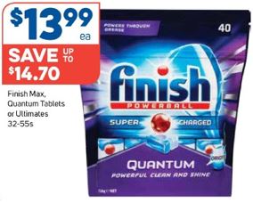
85 It is clear that Professor O’Sullivan regarded the red ball image as a diagnostic cue for finding FINISH capsule products. Having found those products, the forgetful shopper, wanting a particular variant, would need to conduct a second review of the images to find the particular variant.
86 In Professor Klein’s opinion the FINISH POWERBALL Logo was the most diagnostic cue for the consumer to find a FINISH capsule product. She did not consider the depiction of the capsule to be a very efficient cue. In a situation where all brands of dishwashing tablet have a stylised depiction of the product on the packaging, Professor Klein did consider that the image was the most diagnostic cue.
…all the brands have tablets on their package. If only one brand did, then boom, it would be easy and really quick. They all have brands. They’re all different from each other. They use different combinations of colours. So if you sort of remember, “I think mine had yellow,” they’re going to have to look at a bunch of packages to see all the different yellow ones, to see if it’s theirs.
87 Professor Klein’s evidence was that the cognitive effort in recognising the brand name is minimal and takes “milliseconds”, and the same for recognising that the packaging is red “and they’re going to be processing this stuff by looking at the package anyway, so it’s no extra cognitive effort”.
88 I consider Professor Klein’s two-step, brand then variant, process more inherently plausible than Professor O’Sullivan’s red Powerball, then other cue to find the desired product. The consumer is going to be looking at the packaging whether they are looking for the image or the brand — as Professor Klein observed, “they’re going to be processing the brand and packaging colour anyway”. Professor Klein’s two-step brand–variant process is consistent with the experts’ evidence that consumers will use the least number of cues, usually one or two. That a consumer would look at the image on the packaging and not actively see the prominent brand or packaging colour and only focus on the image on the packaging seems much less plausible.
89 Ultimately, beyond my remarks above and what follows in my findings, I do not consider it necessary to resolve the dispute between Professor Klein and Professor O’Sullivan. As the Full Court of this Court has observed (in the context of a claim under s 52 of the Trade Practices Act 1974 (Cth)), expert evidence is of limited assistance in determining whether consumers are likely to be misled, and the question is ultimately a matter for the court’s impression: see Domain Names Australia Pty Ltd v .au Domain Administration Ltd (2004) 139 FCR 215.
CROSS-CLAIM: NON-USE
Section 92: application for removal of trade mark from Register
90 Part 9 of the TMA allows for the removal of a registered trade mark from the Register for non-use. Section 92(1) permits a person to apply to the Registrar for removal of a trade mark from the Register where it has not been in use. Where, as in this case, there is pending litigation concerning the trade mark, the person cannot apply directly to the Registrar but must instead apply to the Court under s 92(3) for an order directing the Registrar to remove the mark.
91 Section 92(4) provides the grounds on which an application under ss 92(1) or (3) can be made. Henkel relies on s 92(4)(b), which permits removal where a mark has been registered for a continuous period of three years but has not been used in Australia. Section 92(4)(b) reads:
An application under subsection (1) or (3) (non-use application) may be made on either or both of the following grounds, and on no other grounds:
(a) …
(b) that the trade mark has remained registered for a continuous period of 3 years ending one month before the day on which the non-use application is filed, and, at no time during that period, the person who was then the registered owner:
(i) used the trade mark in Australia; or
(ii) used the trade mark in good faith in Australia;
in relation to the goods and/or services to which the application relates.
92 The trade mark owner bears the onus to prove use in the relevant period in respect of all goods in respect of which the trade mark is registered (s 100(1)(c) of the TMA). Section 100(1)(c) reads:
(1) In any proceedings relating to an opposed application, it is for the opponent to rebut:
…
(c) any allegation made under paragraph 92(4)(b) that the trade mark has not, at any time during the period of 3 years ending one month before the day on which the opposed application was filed, been used, or been used in good faith, by its registered owner in relation to the relevant goods and/or services.
93 For the purposes of s 100(1)(c), the trade mark owner must establish use of the trade mark, or of the trade mark with additions or alterations not substantially affecting its identity.
94 The use must be by the “registered owner”. Section 7(3) of the TMA provides that an “authorised use” of a registered trade mark is taken to be use of the mark by the registered owner. “Authorised use” and “authorised user” are defined in s 8 of the TMA, which provides in sub-s (1) that a person is an authorised user of a mark if they use the mark under the control of the owner of the trade mark. Without limiting the concept of control in sub-s (1), sub-ss (3) and (4) provide that control can be established by the owner exercising quality control over the goods in relation to which the mark is used, or exercising financial control over the other person using the marks.
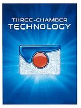
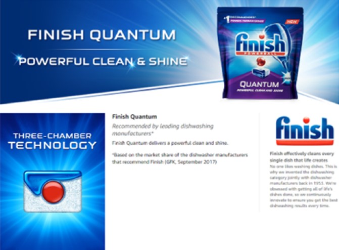
95 The Court has a discretion under s 101(3) of the TMA to allow the trade mark to remain on the Register even if non-use is established during the relevant period. For the discretion to operate in favour of the registered owner, the Court must be positively satisfied that it is reasonable that the trade mark should not be removed.
Applicable principles
Use as a trade mark
96 In order to establish use of the 914 Mark during the relevant period, the use must be use as a trade mark.
97 Section 17 of the TMA provides that “a trade mark is a sign used, or intended to be used, to distinguish goods or services dealt with or provided in the course of trade by a person from goods or services so dealt with or provided by any other person”.
98 The tests regarding what will constitute “use as a trade mark” have been well established. Justice Kitto in Shell Company of Australia Ltd v Esso Standard Oil (Australia) Ltd (1963) 109 CLR 407 (Shell) sets out the relevant question at 425:
… the question becomes whether, in the setting in which the particular pictures referred to were presented, they would have appeared to the television viewer as possessing the character of devices, or brands, which the appellant was using or proposing to use in relation to petrol for the purpose of indicating, or so as to indicate, a connexion in the course of trade between the petrol and the appellant.
99 This approach has been adopted many times: see for example Global Brand Marketing Inc v Cube Footwear Pty Ltd (2005) 66 IPR 19 at [36]–[37]; see also Pepsico Australia Pty Ltd v Kettle Chip Company Pty Ltd (1996) 33 IPR 161 (Kettle Chip) (Sackville J).
100 In E & J Gallo Winery v Lion Nathan Australia Pty Ltd (2010) 241 CLR 144 (E & J Gallo), the majority of the High Court (French CJ, Gummow, Crennan and Bell JJ) at [43] approved the following test for use “as a trade mark” as formulated by the Full Court of this Court in Coca-Cola Co v All-Fect Distributors Ltd (1999) 96 FCR 107 at [19]:
Use ‘as a trade mark’ is use of the mark as a ‘badge of origin’ in the sense that it indicates a connection in the course of trade between goods and the person who applies the mark to the goods …
101 The question of whether a mark has been used as a “badge of origin”, or to distinguish its goods from the goods of other traders, is an objective one, to be determined from the perspective of the consumer: see Shell at 425; Pinnacle Runway Pty Ltd v Triangl Ltd (2019) 148 IPR 211 at [168] (Pinnacle).
102 Justice Allsop (as his Honour then was) in an oft cited passage from Anheuser-Busch Inc v Budejovicky Budvar (2002) 56 IPR 182 (Anheuser-Busch) at [185]–[186] said:
The task is to examine the way the words are used in their context, including the totality of the packaging, to assess their nature and purpose in order to see whether they are used to distinguish the goods from goods of others.
The assessment is made from the perspective of what a person looking at the label would see and take from it, as to the purpose and nature of its use.
(Citations omitted).
103 His Honour also noted at [191] that the branding function can be carried out in different places on packaging with different degrees of strength and subtlety, observing that “of course, the existence on a label of a clear dominant ‘brand’ is of relevance to the assessment of what would be taken to be the effect of the balance of the label”.
104 The display of a sign or mark in relation to goods may, of course, have more than one role. As Allsop J explained in Anheuser-Busch at [189]:
The usage of a word may fulfil more than one purpose on a label. For example a word may have a descriptive element, but also an element of trade mark or branding or distinguishing role. Equally, a word may have a role in identifying a geographical location, but also a trade mark or branding or distinguishing role. It depends on context.
(Citations omitted.)
105 Provided that one of the roles of the mark is to distinguish the trader’s goods dealt with or provided in the course of trade from the goods of other traders, the display of the mark in advertising will be use as a trade mark: see Pinnacle at [171].
106 In Kettle Chip, the Full Court held that the word “KETTLE” was not used as a trade mark in respect of kettle cooked potato chips. Relevantly, the potato chips packet also prominently displayed the well-known trade mark “THINS” and another well-known phrase “DOUBLE CRUNCH”. Sackville J, with whom Lockhart J agreed, said at 213:
The purpose and effect of the words are to be determined by having regard to the context in which they are used. In this connection, the fact that Frito-Lay has used the words in conjunction with its own distinctive mark (THINS and, perhaps, DOUBLE CRUNCH) does not prevent the use being for the purpose of distinguishing its chips from those of other traders. However, the use of the distinctive marks on Frito-Lay’s packets has a bearing on whether the words ‘Kettle Cooked’ have been used to show the commercial origin of the potato chips in the packets, or whether they have some other purpose and effect. It is necessary to consider the words used, as they present themselves to buyers or potential buyers of Frito-Lay’s chips who are to form a view about what they are meant to connote.
Substantially identical
107 For the purposes of rebutting an allegation of non-use, it is enough to demonstrate use if, during the relevant period, it can be shown that a trade mark with additions or alterations not substantially affecting the identity of the registered trade mark has been used.
108 Section 7(1) of the TMA provides that the Court may decide a person has used a trade mark if it is established that the person has used the trade mark with additions or alterations that do not substantially affect the identity of the trade mark. This has been interpreted to require that the two marks must be substantially identical to each other: Optical 88 Limited v Optical 88 Pty Ltd (No 2) (2010) 89 IPR 457 (Optical 88 (FCA)) at [256], affirmed in Optical 88 Ltd v Optical 88 Pty Ltd (2011) 93 IPR 202 (Optical 88 (FCAFC)) at [35]–[39] and PDP Capital Pty Ltd v Grasshopper Ventures Pty Ltd (2021) 160 IPR 174 (PDP Capital) at [161].
109 The test for assessing substantial similarity involves a side by side comparison of the two marks. The Court must be satisfied that, when viewed side by side, having regard to their similarities and differences, a total impression of similarity emerges from a comparison of the two marks: Shell at 414; PDP Capital at [161]; Carnival Cruise Lines Inc v Sitmar Cruises Ltd (1994) 31 IPR 375 at 391.
Authorised use
110 Authorised use of a mark requires the trade mark user to establish “control as a matter of substance”: see Lodestar Anstalt v Campari America LLC (2016) 244 FCR 557 at [97] (Lodestar); Ceramiche Caesar SPA v Caesarstone Ltd (2020) 154 IPR 237 (Ceramiche). Determining whether there has been control will be a case-specific enquiry and a question of fact and degree: Lodestar at [98]; Ceramiche at [40].
111 In Lodestar, the Full Court of this Court determined that control was not made out. While the trade mark owner had issued a licence to the trade mark user, that, without more, is not sufficient to establish control within the meaning of s 8 of the TMA: Lodestar at [97], [108]. Examining the terms of the licence and the evidence before the Court, Besanko J (Allsop CJ, Greenwood and Nicholas JJ agreeing) found at [107] that the quality control provisions did not have a precise standard, and there was no evidence of the registered trade mark owner ever contacting the user to ensure compliance.
112 In Trident Seafoods Corporation v Trident Foods Pty Ltd (2019) 143 IPR 1 (Trident), a differently constituted Full Court considered authorised use in the context of a corporate group where one entity held the registered marks while another used them. The Court differentiated the factual circumstances from those in Lodestar, finding that in this situation the companies had a “unity of purpose” and common directors. At [45]–[46], the Full Court said:
The issue is not whether one company controlled the other but rather whether Trident Foods, even though a wholly owned subsidiary of Manassen, had control over Manassen’s use of the trade marks. In that sense it is significant that at all relevant times the two companies had the same directors. It must be inferred from the evidence that the two companies operated with a unity of purchase. Trident Foods held the trade marks. Manassen sold the products under the TRIDENT brand and thereby used the trade marks… This is not a case like Lodestar in which there was no relationship between the owner and user of the marks beyond a licence. This case is at the other end of the spectrum. As Trident Foods submitted, it is commercially unrealistic in the circumstances of the present case not to infer that the owner of the marks controlled the use of the marks because the common directors necessarily wished to ensure the maintenance and enhancement of the value of the brand. The fact that this must also have been Manassen’s purpose simply confirms the unity of purpose between the corporate entities. But unity of purpose is not inconsistent with the existence of control in a case such as the present.
… The natural and ordinary inference given the relationship between the companies would be of unity of purpose, rendering redundant any particular illustration of the actual control of Trident Foods must have had as the owner of the marks. Unity of purpose is indicative of the existence of actual control vested in Trident Foods as the entity owning the marks over Manassen as the entity using the marks.
The 914 Mark
The parties’ submissions
113 Taking the 914 Mark first, Henkel contends there are four reasons why the 914 Mark should be removed for non-use.
114 First, to the extent that RB has used product images on packaging and related marketing materials, those images are not substantially identical to the 914 Mark.
115 Second, even if the Court finds that the Finish capsule images are substantially identical to the 914 Mark, RB has not used the product images as a trade mark, but rather has used the images to identify the dishwashing capsule products being offered for sale.
116 Third, RB has not used the 914 Mark under the control of RB BV. In other words, to the extent there has been any use of the 914 Mark it has not been use by the trade mark owner, or with their authorisation.
117 Fourth, RB has not used the 914 Mark in relation to goods for which it is registered in classes 1 and 3, other than dishwashing products.
118 RB relies on three “marks” it used during the relevant period to demonstrate use of the 914 Mark.
(a) The Quantum Device (as shown on the front of the FINISH Quantum packaging):
(b) The Quantum Ultimate Device (as shown on the front of the FINISH Quantum Ultimate packaging):
(c) The Quantum Ultimate Product (being product depictions in television commercials, on the Amazon webpage and on some historical forms of packaging):
119 RB submits that on the basis of the examples of use of the marks set out above it has used the 914 Mark, or the 914 Mark with additions or alterations that do not substantially affect its identity, during the relevant period.
120 RB accepts that there has not been use of the 914 Mark on the non-dishwashing products in the registration, but relies on the Court’s discretion to retain the registration for those products. RB submits that it would not be in the interests of the parties or the public to remove the mark, as RB has not abandoned the 914 Mark and products bearing the 914 Mark remain on sale. Retaining the 914 Mark on the Register would maintain the purity of the Register rather than undermining its integrity.
Consideration
Substantial identity
121 I now turn to the question of whether RB has used a mark substantially identical to the 914 Mark during the relevant period.
122 The 914 Mark is a three dimensional shape mark. The 914 Mark is defined in the endorsement as:
… a rectangular shaped capsule with rounded corners; the capsule has a RED cylindrical compartment embedded in the capsule; the RED centre is partly encircled by a BLUE portion of the capsule resembling a wave; the BLUE wave portion of the capsule is made of a gel substance; the remaining portion of the capsule consists of multicoloured granules of powder.
123 The Quantum Ultimate Product is shown face-on in some of the product packaging (as depicted in supermarket catalogues), in the Amazon online store, and in television commercials. In these contexts, a three dimensional view of the product is not available.
124 The Quantum Ultimate Product has several similarities to the 914 Mark, including:
(a) a rectangular shaped capsule with rounded corners;
(b) a red circle in the centre of the top surface of the product which is flush with the surface of the product.
125 The endorsement to the registration of the 914 Mark notes that capsule has a red cylindrical compartment embedded in the capsule. In the depiction of the 914 Mark, the cylinder appears as a red circle on the top surface of the capsule which is flush with the surface. It is not possible from the depiction alone to know whether the red circle is a spot, or whether the red has depth and extends into or through the capsule, or whether it is visible on the bottom of the capsule. Likewise, in the Quantum Ultimate Product there is a red circle on the top surface which is flush with the surface, it is not possible to see whether the circle has depth and extends into or through the product.
126 Additional similarities between the 914 Mark and the Quantum Ultimate Product exist. The red circle in the centre of the top surface of the product is partly encircled by a blue portion of the product loosely resembling a wave. The blue portion of the product appears to be made of a gel substance.
127 The contours of the blue and white compartments of the Quantum Ultimate Product emphasise the shape of the blue wave and central red circle, as does the 914 Mark.
128 The remaining portion of the Quantum Ultimate Product as pictured on the packaging appears to consist of white granules of powder, not the multi-coloured granules of the 914 Mark endorsement. It is not clear whether the granules depicted in the Amazon advertisement of the Quantum Ultimate Product have faint speckles.
129 The multi-coloured speckles are only faintly visible as dots on the representation of the 914 Mark on the register. I do not consider that the absence of multi-coloured speckles in the non-blue wave section of the Quantum Ultimate Product substantially affects the identity of the 914 Mark.
130 For those reasons, I consider that the Quantum Ultimate Product as depicted on the packaging is substantially identical to the 914 Mark.
131 However, I do not consider that the Quantum Device nor the Quantum Ultimate Device (together, the Quantum Devices) are substantially similar to the 914 Mark.
132 There are significant differences between the 914 Mark and the Quantum Devices (the only difference between the two Quantum Devices being the presence of a blue spiral in the Quantum Ultimate Device which is not present in the Quantum Device). A comparison between the Quantum Devices and the 914 Mark shows that there are material differences such that no total impression of similarity emerges.
133 Both the Quantum Devices feature a prominent red ball floating above the capsule. In contrast the 914 Mark does not feature any image of a red ball. The endorsement refers to a red cylindrical compartment being “embedded” in the capsule and the depiction has a flat red circle flush with the top surface. Even though the cylinder of the 914 Mark is not visible to the viewer, it is apparent to the viewer of the Quantum Devices that the red ball floating above the capsule is not the embedded “cylindrical compartment” of the endorsement.
134 The red cylindrical compartment is said in the endorsement to be partly encircled by the blue section. In the 914 Mark depiction, the red circle is partly encircled by the blue wave like section of the capsule. In the Quantum Devices the red ball is suspended above the surface of the capsule; there is no contact between the red ball and the capsule, including the blue section.
135 The red ball in the Quantum Devices floats above the capsules, it is wholly separated from the capsule. In contrast the 914 Mark endorsement refers to a red cylindrical compartment and the depiction has a flat red circle flush with the top surface. In both the endorsement and the depiction, the red element is wholly connected with the capsule, either flush with the surface in the case of the depiction, or embedded within the capsule.
136 The separation of the red ball from the capsule is emphasised in the Quantum Devices by a “star burst” effect which surrounds the red ball, and of which reflections can be seen on the surface of the red ball. There is also a translucent column of light emanating from the empty hole or cavity in the capsule which connects the ball to the capsule, and suggests that the red ball has burst or exploded dynamically from the capsule. The dynamic movement of the red ball in the Quantum Devices has no counterpart in the 914 Mark.
137 In addition to the “star burst” effect and translucent column, the Quantum Ultimate Device has a blue spiral which starts in the blue section of the capsule and coils one and a half times to finish on the far side of the red ball. This further emphasises the dynamic movement of the red ball and its separation from the surface of the capsule. Again there is no counterpart in the 914 Mark to the blue spiral.
138 The Quantum Devices are not substantially identical to the 914 Mark.
Use as a trade mark
139 I now turn to consider whether RB has used the 914 Mark as a trade mark during the relevant period, being 16 July 2018 to 16 July 2021. Given my finding that the Quantum Devices are not substantially identical to the 914 Mark, it is only necessary to consider whether RB used the Quantum Ultimate Product as a trade mark during the relevant period.
140 The use of the Quantum Ultimate Product relied upon by RB is
(a) use on product packaging for various Finish Quantum products sold or advertised for sale;
(b) use in television commercials for the Finish Quantum Ultimate product; and
(c) use on the Finish Quantum product page on the Amazon website.
141 The first example of “use” of the 914 Mark on product packaging was the purple FINISH Quantum package pictured in a South Australian Foodland catalogue published during the relevant period.
142 The purple packaging has the FINISH POWERBALL Logo prominently displayed at the centre of the top of the packaging. Under the FINISH POWERBALL Logo is a Quantum Device in the centre of the packaging, with the word “QUANTUM” underneath on a triangular purple section.
143 A row of four Quantum Ultimate Products is displayed at the bottom of the packaging. The two centre Quantum Ultimate Products are mostly obscured by the purple triangular section that rises up from the bottom of the packaging. The far left and right Quantum Ultimate Products are partially obscured by the purple triangular section, with about three quarters of each visible.
144 I do not consider that the use of the image of the Quantum Ultimate Product is use as a trade mark on this packaging. The only purpose of the presence of the Quantum Ultimate Product image on this packaging is to show what the product inside the packaging looks like. This is not an example of use of the 914 Mark as a trade mark.
145 A further example of “use” on product packaging was taken from a weekly specials catalogue for the Supabarn Farmer’s Market supermarket chain published during the relevant period.
146 In this packaging, there is a clear cut out on the front of the bag, where shoppers can see six of the actual Quantum tablets inside the packaging.
147 Again, I do not consider this packaging to be use of the 914 Mark as a trade mark. Although this packaging does allow shoppers to see the actual product, that product in my view is not functioning as a trade mark. Rather the clear window in the packaging allows the customer to see what the tablets that are otherwise concealed in the packaging look like, taking the place of the stylised depiction.
148 The next examples of use relied upon by RB were use displayed during television commercials broadcast during the relevant period. Three commercials were relied upon, each advertising FINISH Quantum Ultimate, and contained images such as the following.
149 Henkel accepted Mr Le Guay’s evidence that the three commercials were broadcast during the relevant period.
150 The first commercial begins with the focus on a packet of FINISH Quantum Ultimate in the centre of the screen on a blurred white kitchen bench and a voice over saying “new FINISH Quantum Ultimate with even more cleaning power”.
151 The FINISH Quantum Ultimate packaging which appears in each of the television commercials has the FINISH POWERBALL Logo prominently displayed at the centre of the top of the packaging. Under the FINISH POWERBALL Logo is a Quantum Ultimate Device in the centre of the packaging, with the words “Quantum Ultimate” underneath on a triangular silver section.
152 In an animated sequence the Quantum Ultimate Device on the front of the package transforms into a Quantum Ultimate Product which explodes into round droplets of blue and white liquid. The blue and white liquid droplets then swirl amongst the dirty dishes and glasses to clean them, including, according to the voiceover, by removing grease and leaving them shining. It is during this sequence that the two images relied on by RB appear.
153 The transformation sequence commences with the red ball suspended above the tablet on the packaging sinking down into the tablet and being absorbed into and becoming a part of the tablet. The tablet then rises out of the packaging to become a Quantum Ultimate Product which comes towards the viewer and for an instant an image like the 914 Mark is seen. It appears that it is during this sequence that the image of the product packaging image (with the Quantum Ultimate Product rather than the Quantum Ultimate Device) above is taken.
154 The Quantum Ultimate Product is then seen for an instant in a dishwasher before exploding into white, blue and red balls which, in turn, explode outwards. On closer examination the white ball appears to be a clear ball containing granules. The focus of the commercial is then only on the white and blue balls as they travel towards the dirty dishes. Where the balls splatter on the dishes, the dishes are clean. A blue ball then swirls around a glass leaving it clean and shining.
155 For the last three seconds of the 15-second advertisement the FINISH Quantum Ultimate packaging (as seen at the start of the advertisement) is displayed.
156 In the first commercial, the display of the Quantum Ultimate Product in the form shown above is the fleeting appearance during the transformation at around the two second mark.
157 Even less time is devoted to the shot of the product packaging with the Quantum Ultimate Product, which appears only as part of the sequence whereby the Quantum Ultimate Device on the packaging transforms to the Quantum Ultimate Product in the dishwasher.
158 The second commercial is 30 seconds in length. The first 10 seconds are taken up showing various families sharing a meal. At the 11 second mark the same image of the FINISH Quantum Ultimate packaging on a blurred white kitchen bench as seen in the first commercial appears. The same animated transformation sequence as described above then takes place at the same speed as in the first commercial. The FINISH Quantum Ultimate packaging is prominently displayed for the last four seconds of the commercial.
159 The third commercial is also 30 seconds long. It commences by looking at a number of control panels of dishwashers from “leading” dishwasher manufacturers. At the 10-second mark a man in a white lab coat appears holding a tablet device on which the name of three dishwashing product brands: FAIRY, LOGIX and EARTH CHOICE. The man swipes the display of the tablet across to reveal only the FINISH logo (in the same form as the FINISH POWERBALL Logo, but without the white text reading “powerball” on the red portion).
160 Next, the FINISH Quantum Ultimate packaging is seen and the transformation animation sequence occurs, if anything, faster than in the other two commercials. The man in the lab coat reappears at about the 24 second mark, holding the FINISH Quantum Ultimate packaging. The last few seconds of the commercial has the FINISH Quantum Ultimate packaging displayed underneath the logos of seven “renowned” dishwasher manufacturers.
161 In each of the three commercials, it is only possible to discern the stages of the transformation animated sequence described above by stopping the video at millisecond intervals. This is a facility not available to the ordinary viewer of the advertisement on the television during a commercial break. The impression left with the ordinary viewer when the commercial is viewed in its entirety is of the FINISH Quantum Ultimate packaging, as this packaging is displayed at the start and finish of the advertisement for a time sufficient for the viewer to see and read the packaging. This impression is reinforced by the voiceover which emphasises the FINISH brand, for example ending “Choose the Number 1 recommended brand, FINISH”. The viewer is left in no doubt that what is being advertised is a dishwashing capsule product made and offered for sale under the FINISH brand.
162 The two still images relied upon by RB to show use as a trade mark are decontextualised images, removed from the context in which the consumer viewing the advertisement would actually see them. They are visible if the viewer knows to look for them, and then only if the viewer is able to stop the video to see them, otherwise their appearance is at best fleeting and overwhelmed by the surrounding colour and movement of the advertisement.
163 These fleeting glimpses of the 914 Mark are not dissimilar to the animated humanised oil drop in the Shell case. In that case, a humanised oil drop was seen throughout the advertisement, but there were only ‘fleeting glimpses of substantial identity’.
164 In Shell at 425, Kitto J (with whom Dixon and McTiernan JJ agreed) posed the following question:
…whether, in the setting in which the particular pictures referred to were presented, they would have appeared to the television viewer as possessing the character of devices, or brands, which the appellant was using or proposing to use in relation to petrol for the purpose of indicating, or so as to indicate, a connexion in the course of trade between the petrol and the appellant.
165 Kitto J then considered the question:
Clearly they were used so that the figure in all its varying forms would be understood as representing Shell petrol for the purposes of the disjointed tale that is told. But the connexion in the films between the oil drop man and the petrol he symbolizes is a connexion limited by the purpose of the occasion. At every point of the exhibition, whether the resemblance to the respondent's trade marks be at the moment close or remote, the purpose and the only purpose that can be seen in the appearance of the little man on the screen is that which unites the quickly moving series of pictures as a whole, namely the purpose of conveying by a combination of pictures and words a particular message about the qualities of Shell petrol. This fact makes it, I think, quite certain that no viewer would ever pick out any of the individual scenes in which the man resembles the respondent's trade marks, whether those scenes be few or many, and say to himself: “There I see something that the Shell people are showing me as being a mark by which I may know that any petrol in relation to which I see it used is theirs.” And one may fairly affirm with even greater confidence that the viewer would never infer from the films that every one of the forms which the oil drop figure takes appears there as being a mark which has been chosen to serve the specific purpose of branding petrol in reference to its origin. No doubt if, later, the viewer were to come across the respondent's trade mark used in relation to petrol his recollection of the films might lead him to think that the appellant, taking advantage of a reputation created for the oil drop figure by means of the films, had adopted the figure, in one of its forms, as a mark for its petrol. But that would be quite a different matter from inferring, while sitting in front of his television set, that the figure in one or more, some or all, of its exhibited forms was being placed before him there as a trade mark for Shell petrol.
166 This reasoning applies with respect to each of the three commercials relied upon by RB, and the short animated sequence within them. The FINISH Quantum Ultimate Product appears fleetingly in the commercials for the purpose of conveying by a combination of pictures and words a particular message about the qualities of the FINISH Quantum Ultimate capsules the subject of the commercials. The FINISH Quantum Ultimate capsule is depicted in a functional role to demonstrate the cleaning power of the FINISH Quantum Ultimate capsule. The image of the FINISH Quantum Ultimate Product appears fleetingly in the course of the animated sequence (which itself only occupies a brief portion of the commercial) the purpose of which is to show the FINISH Quantum Ultimate Product quickly and effectively cleaning dirty dishes and leaving them sparkling. It is not used to designate trade origin. That role is performed by the prominent use of the FINISH brand name and FINISH POWERBALL Logo, both in the text displayed throughout the commercials, on the packaging depicted, and in the voiceovers which form part of the commercials.
167 I do not consider that the fleeting images of the Quantum Ultimate Product in any of the three television commercials constitute trade mark use.
168 RB’s third example of use is the display of the following images on the Amazon online store during the relevant period:

(the Three-Chamber Technology Images).
169 RB relied on Mr Le Guay’s evidence that finalised web content including the Three-Chamber Technology Images was provided by RB to Amazon on or about 8 June 2018 (the month before the relevant period), and that similar content was available on the Amazon website on 23 August 2021 (the month after the relevant period). RB asked the Court to infer that like content had been available on the Amazon online store during the relevant period. I am prepared to make the inference sought, that the material existed on the Amazon site during the relevant period. The question is whether it constitutes use as a trade mark.
170 The Three-Chamber Technology Images display an image of the Quantum Ultimate Product under the heading “THREE-CHAMBER TECHNOLOGY” and in one of the images the capsule is annotated to identify the three elements of the capsule: the “supercharged Powerball”, the gel, and the powder.
171 Henkel relied on Ms Cade’s evidence that showed that the material on the Amazon website in late August 2021 was not the same as the finalised web content. This material also provided context as to how a consumer would navigate the Amazon website to find the Three-Chamber Technology Images.
172 Ms Cade’s evidence was that the three-chamber technology images relied upon by RB were not immediately available to the viewer on the Amazon website. In order to view the Three-Chamber Technology Images on which RB relies it was necessary for her to take several steps once she had opened the Amazon.com.au website, including entering the search term “Finish Quantum” into the Amazon site search bar.
173 Ms Cade’s search produced many different FINISH products, including dishwasher tablets and other products such as rinse aid and machine cleaner. All of the FINISH products in the search results bore the prominent FINISH brand, and the word FINISH in the product description under the pictures. The FINISH brand was also displayed in a banner at the top of the webpage, along with the phrase “Amazing Value Packs on Finish Dishwasher Tablets” (see example below). Ms Cade’s evidence was that the particular product relied on by RB was the seventeenth product listed after searching for “Finish Quantum” in the Amazon search bar.
174 Ms Cade’s evidence was that, after scrolling down the search results page to the particular product, upon clicking the product page, the main image displayed was that of the product packaging, with a row of small thumbnails (including the Three-Chamber Technology Images) located at the left hand side. Ms Cade could transition from the main image to one of the other images by clicking on the small thumbnails. The image of the packaging was the “default image” each time Ms Cade visited the webpage.
175 Ms Cade gave evidence that the webpage also included a separate Three-Chamber Technology Image further down the page. This image could be seen after scrolling down approximately one-third of the webpage.
176 Ms Cade also clicked on to the pages of the 16 FINISH products appearing higher in the search results than the relevant product. She observed that none of them displayed the Three-Chamber Technology Images.
177 RB submitted that the depiction of the product in the Three-Chamber Technology Images on the Amazon website were used for more than one purpose. It is being used to convey some information to the consumer about the makeup of the products (including the red Powerball), as well as functioning as a trade mark.
178 The evidence shows that no consumer would ever be immediately confronted with the Three-Chamber Technology Images on entering the Amazon website or searching for “finish quantum”. There are no instances of use of the Three-Chamber Technology Images as the primary image in any advertising use, whether in a supermarket catalogue, television commercial, or online. To the contrary, the evidence is that to find these images, the consumer would need to follow the process undertaken by Ms Cade: to go to the Amazon website, search for “finish quantum”, scroll past 16 other FINISH products displayed as a result of the search (each bearing the prominent FINISH brand), click on the 17th product, and then, once on the page (displaying a large package of FINISH Quantum), click on to the fourth thumbnail at the side of the page (or, alternately, scroll through several further pages of information relating to the product).
179 At best, all that can be inferred from the evidence, is that during the relevant period, one page on the Amazon website (being for the particular FINISH Quantum product) displayed an image of the 914 Mark, accessible only if the consumer clicked on the thumbnail or scrolled through the information on the page.
180 The Three-Chamber Technology Images were not immediately available to consumers who searched for a FINISH Quantum product on the Amazon website. It was a matter of chance whether the consumer selected the product page which contained the images from amongst the many that did not.
181 As Henkel submits, the reasoning of the Full Court in Nature’s Blend Pty Ltd v Nestle Australia Ltd (2010) 87 IPR 464 is apposite (Nature’s Blend). Adopting the language of the Full Court at [42]:
[B]y the time the consumer has [viewed the Three-Chamber Technology Images], if indeed the consumer does so, he or she has already seen that it is in [a FINISH] brand of product with the name of the product variant being [Quantum Max]. If the consumer does go on to [see the Three-Chamber Technology Images], the consumer is well aware by that stage that the brand and commercial source is [FINISH].
182 Taking into account the context in which the Three-Chamber Technology Images appear, I do not consider that the images on the Amazon website constitute trade mark use. The images are not being used to distinguish FINISH goods from those of others. By the stage at which the images are encountered on the website, the consumer is well and truly aware that they are looking at a particular variant of a FINISH product on the Amazon site. The images are used to highlight particular technical attributes of the tablets — that they utilise ‘three-chamber’ technology — and not as a badge origin.
Non-use on products other than dishwashing products
183 The 914 Mark is registered in relation to goods in Classes 1 and 3. Henkel contends that RB has not used the 914 Mark in relation to any of the goods listed in Class 1, and the non-dishwashing related goods in Class 3.
184 RB accepts that it has not used the 914 Mark in relation to some of the listed goods on the registration (namely carpet cleaners and dry-cleaning fluid). RB contends that the Court should exercise its discretion under s 101(3) favourably to retain the registration as it stands. I will deal with this issue in my consideration of the discretion below.
The 311 Mark
The parties’ submissions
185 Henkel submits that, to the extent that it has appeared on product packaging, the 311 Mark has not been used as a trade mark. Rather, the part bearing resemblance to the 311 Mark has been used as a small, constituent part of the stylised trade mark FINISH, being the red Powerball placed over the second “i”.
186 Relatedly, Henkel submits that there is no evidence that the 311 Mark has been used in isolation. Henkel characterises the mark as, at best, a “limping trade mark, needing the crutch of [FINISH]” to designate commercial origin (adopting the language from Philips Electronics NV v Remington Consumer Products (1997) 40 IPR 279 at 282).
187 RB relies on the use of the 311 Mark as a constituent part (being the red Powerball above the second ‘i’) of the FINISH brand logo to show that the 311 Mark has been used as a trade mark throughout the period.
188 RB submits that the 311 Mark has been used as a distinct component of the FINISH logo (pictured below) which features on the packaging of all FINISH products and promotional materials.

189 RB submits that the 311 Mark stands out visually and conceptually as a distinctive part of the FINISH brand logo. RB draws attention to the contrast of the red ball to the blue text and background, the central positioning of the red ball, and the white “sunburst” rays. RB further submits that the 311 Mark in this context conjures the notion of the Powerball for which the FINISH brand is known.
Consideration
190 It is well-established that use of a mark that is a component of a larger composite mark, or a mark used in conjunction with other marks, can still constitute use of a trade mark: see Chocolaterie Guylian NV v Registrar of Trade Marks (2009) 180 FCR 60 at [97] (Guylian); Sports Warehouse Inc v Fry Consulting Pty Ltd (2010) 186 FCR 519 at [133] (Sports Warehouse); Phone Directories Company Australia Pty Ltd v Telstra Corporation Limited (2014) 106 IPR 291 at [245] (Phone Directories).
191 In BP plc v Woolworths Limited (2004) 212 ALR 79 (BP v Woolworths), Finkelstein J considered case law from the US and the principles governing when separate components are registerable. His Honour observed at [64]:
Separate components of a single get-up or design may qualify for registration as a mark. They will be capable of registration if each feature considered separately distinguishes the goods or services in question. If the get-up or design creates “a separate and distinct commercial impression” then the separate parts will not be registrable. However, if each separate part creates an impression which is totally separate from the others and is distinctive, that is it performs the trade mark function of identifying the source of the goods and services to customers, that will suffice.
192 In Colorado Group v Strandbags Group No 2 (2006) 69 IPR 281 (Colorado), Finkelstein J observed at [8] that in very limited situations it was possible to dissect a total image to obtain proprietorship (and trade mark registration) of only one component of the total image. The test he adopted was the one he extracted from looking at the US cases in BP v Woolworths:
[W]hether the component created “a separate and distinct commercial impression” from the other components, so that it might be said of the distinct component that it performs a trade mark function.
193 In Colorado Finkelstein J described the situation where one or more elements of a combination mark is an individual mark for which registration can also be obtained as “rare”, but more likely to occur in the case of a word and device mark, because often the word is the dominant portion of a combination mark. In that case, Finkelstein J held that the combination mark COLORADO with a “simple mountain motif” was not a combination mark comprised of several distinct trade marks: Colorado at [9]. His Honour also noted at [9] that evidence going to the impact of the marks was not determinative, and that ultimately the matter was one of judicial impression.
194 The evidence in relation to the use of the 914 Mark during the relevant period (discussed above) showed that the FINISH POWERBALL Logo was prominently displayed on all FINISH Quantum and Quantum Ultimate packaging and featured in supermarket catalogues, television commercials, and displayed on the Amazon website. I find there has been extensive use of the FINISH POWERBALL Logo as trade mark during the relevant period.
195 On the other hand, there is no evidence that the 311 Mark has been used on its own, either during or outside of the relevant period.
196 I do not consider that the totality of the FINISH POWERBALL Logo gives the impression of several distinct trade marks. As a consequence, I do not consider that the red Powerball on the FINISH POWERBALL Logo constitutes use of the 311 Mark.
Authorised use
197 Given my findings regarding use above, it is not necessary to determine whether RB was an authorised user of the Marks. However, given the parties made submissions on the matter, I will briefly deal with the issue.
The parties’ submissions
198 Henkel submits that, should I find there has been use of the 914 and 311 Marks, that use has been by RB — and not by RBF. Henkel further submits that the evidence does not establish that RBF has exercised any control over RB’s trade mark usage, so that RB’s usage has not been “authorised use” within the meaning of s 8 of the TMA. In other words, RBF has failed to discharge its onus, as the registered owner of the Registered Marks, under s 100(1)(c) of the TMA.
199 Henkel relies on evidence of the contractual and licencing arrangements between various groups in the RB Group of companies. The essence of the contractual arrangement is that RBF owns the Registered Marks, and has granted a license to RB Brands (a UK based company). In turn, RB Brands has sub-licensed the right to use the Registered Marks to RENA (a Netherlands based company). RENA has then sub-sub-licensed the right to use the Registered Marks to RBA and then to RB. Henkel makes several submissions about the licensing arrangements.
(a) There is not, and has never been, any direct contractual relationship between RBF (the owner of the Registered Marks) and either RBA or RB (the entities said to have used the Marks).
(b) There is not, and has never been, any direct contractual relationship between RB Brands (being the entity granted a license by RBF) and either RBA or RB.
(c) There is no evidence that RBF has any involvement in, or ever approved, the granting of the sub-licenses by RB Brands or RENA.
(d) RBF’s delegation of responsibility to RB Brands, and RB Brands’ delegation of responsibility to RENA, has effectively estranged RBF entirely from any use of the Registered Marks in Australia.
(e) While the various licenses entitled the licensors to inspect the use of the Registered Marks, there is no evidence that either RBF, RB Brands or RENA have ever exercised those rights.
(f) Evidence adduced by RB is that the global marketing team for the FINISH brand is based in Germany, while the relevant corporate entities are based in the Netherlands (RBF and RENA) and England (RB Brands). RB and RBF have not demonstrated any relationship or control over the marketing team in Germany.
(g) The ultimate holding companies of RBA and RB are Reckitt Benckiser PLC and Reckitt Benckiser Group PLC. There is no evidence of their relationship to RBF so it cannot be established that RBF has exercised financial control (in the sense of s 8(4)(b) of the TMA) over RBA and RB.
200 RB’s central submissions in response to Henkel’s claims about the contractual arrangements primarily relate to Henkel’s narrow interpretation of the authorities, and mischaracterisations of the arrangements. RB addresses Henkel’s submissions above as follows.
(a) Henkel’s focus on the lack of a “direct contractual relationship” between RBF and RBA/RB are based on the false premise that a direct contractual relationship is required by the TMA — when in fact s 8 simply requires that one party exercises “control” over the other. RB emphasises the commercial reality that modern corporate structures in global businesses are often complex and relationships between two group members may be linked through intermediaries.
(b) It can be inferred that RBF consented or approved of the downstream licensing agreements, given that RENA was defined as an “Affiliate” of RB Brands, and RBA and RB an “Affiliate” of RENA. In relying on the agreements, RBF submits that it has affirmed its consent.
(c) There has been no abrogation of responsibility by RBF, as contended by Henkel. Rather, the proper construction of the relevant clauses is that there is an overall effect of additional control, in that the licensee must ensure the sub-licensees’ compliance with the principal agreement.
(d) Further evidence of RBF, RB Brands or RENA exercising contractual rights to inspect, monitor or control is not required in circumstances where the entities have at all material times been affiliates and part of the RB Group, and where it can be inferred that RBF, RB and RBA at all material times operated with the common purpose of maximising sales of FINISH branded products and enhancing the value of the FINISH brand.
Consideration
201 Henkel’s submissions on authorised use extract the concept of “actual control… from time to time… as a matter of substance” from Lodestar at [97]. The full paragraph is set out below:
I think control in s 8 means actual control in relation to the use of the trade mark and it means actual control in relation to the trade mark from time to time. I think (as the primary judge did) that that is the primary meaning of the word, and the English cases, so far as they go, support that conclusion. Control involves questions of fact and degree as does the notion of a sufficient connection. There must be control as a matter of substance. For example, I do not think that it could be suggested that the mere fact that the registered owner granted a licence or revocable authority to use the trade mark would be sufficient without more established control within s 8. That would be inconsistent with the approach taken under the 1955 Act and the Trade Marks Act 1938 (UK). Had it been Parliament’s intention it could be effected by a much simpler provision than s 8.
202 However, in Lodestar, Besanko J also approved of the following passage of Aickin J in Pioneer Kabushiki Kaisha v Registrar of Trade Marks (1977) 137 CLR 670 at 683:
[T]he essential requirement for the maintenance of the validity of a trade mark is that it must indicate a connexion in the course of trade with the registered proprietor, even though the connexion may be slight, such as selection or quality control or control of the user in the sense in which a parent company controls a subsidiary. Use by either the registered proprietor or a licensee (whether registered or otherwise) will protect the mark from attack on the ground of non-use, but it is essential both that the user maintains the connexion of the registered proprietor with the goods and that the use of the mark does not become otherwise deceptive.
203 The facts determinative of the question of control in Lodestar were very different to the facts in the present case. In Lodestar, two unrelated companies had negotiated the terms of a licence agreement to advance their separate commercial interests. The trade mark owner (Austin Nichols), executed a licence agreement with an unrelated Australian company (WGW) permitting it to use the words WILD GEESE and WILD GEESE WINES on wines. In an action for removal for non-use brought by a third party, the only use that could be shown during the relevant period was use by WGW. In proceedings concerning revocation of Austin Nichols’ marks, Austin Nichols sought to rely on the agreement with WGW.
204 The Full Court held that control was not established. The evidence did not show that WGW’s winemaking processes were in any way impacted by the licence or by Austin Nichols. The trade mark owner did not, as a matter of fact, display any control over WGW or of the quality of the wine bearing the marks.
205 In my view, Henkel takes the remarks in Lodestar out of context. A more illustrative (though not determinative) case to examine is Trident.
206 In Trident, the trade mark owner was a wholly-owned subsidiary of the trade mark user. However, it was sufficient to make out authorised use where it could be inferred from the facts (in this case that there was a commonality of directors) that the entities operated with a “unity of purpose” to “maximise sales and to enhance the value of the brand”.
207 While evidence was not extensive, Mr Barooah gave evidence about the oversight of the marketing team. I accept that there is a certain degree of group-wide control, ensuring quality standards and consistency across FINISH-branded products sold globally.
208 I also accept that it can be inferred that RBA, RB, and the various overseas entities at all relevant times were working with the purpose of maximising sales of FINISH-branded dishwashing products.
209 It follows that, if RB had used the Registered Marks during the relevant period, that use would have been authorised use.
Discretion under s 101(3)
The parties’ submissions
210 RB submits that, in the event I find non-use for any of the grounds considered above, I should exercise my discretion under s 101(3) of the TMA not to remove the Registered Marks from the Register.
211 RB submits that it had not abandoned the Registered Marks. Products bearing both marks are said to be currently on sale. I note that this submission suffers from the same faults as the examples of use during the relevant period, which means I have found that the marks are not being used as a trade mark.
212 RB submits that removal of the Registered Marks would not be in the interests of the parties or the public.
213 RB submitted that both marks have retained a real and ongoing connection in the minds of consumers, as badges of origin for the FINISH brand. Removing both marks would effectively “clear the way” for Henkel to use the SE Logo (both on product packaging and in off-pack advertising) in an unrestricted fashion in relation to dishwashing products, which would almost inevitably result in consumer deception and confusion, and at the very least would have the effect of depriving consumers the benefit of a functioning badge of origin. That is, purchasers who have hitherto accepted the marks as badges of origin for the FINISH brand will, having seen the SE Logo being used as a badge of origin, suddenly find the removed mark(s) to be ambiguous and therefore no longer suitable for that purpose.
214 RB contends that in these circumstances, retaining both the 914 and 311 Marks on the Register would not undermine its integrity or purity. It would maintain it.
215 Henkel submits that RB has failed to identify any reason why the discretion conferred by s 101(3) should be exercised in its favour.
Consideration
216 As Henkel correctly submits, it is for the registered owner to satisfy the Court that it would be reasonable not to remove the mark, notwithstanding that the power to order removal is enlivened: see Taxiprop Pty Ltd v Neutron Holdings Inc (2020) 156 IPR 1 at [155].
217 Section 101(3) of the TMA provides that if satisfied that it is reasonable to do so, the Court may decide not to remove a challenged mark from the register even where the grounds of challenge have been established. The discretion afforded under s 101(3) of the TMA is broad and unfettered, limited only by the subject matter and purpose of the Act: Lodestar at [35]. Its exercise is not preconditioned on the existence of “exceptional circumstances”: Optical 88 (FCA) at [273]
218 Relevant considerations in the exercise of the discretion will include whether the mark has been used in respect of similar goods or closely related services, or similar services or closely related goods (s 101(4)). The exercise of the discretion is not conditioned upon the existence of “exceptional circumstances” before it can be exercised in favour of the trade mark owner: Optical 88 (FCA) at [273].
219 In Hermes Trade Mark [1982] RPC 425, an application was made for the removal of the trade mark “Hermes”, in relation to watches, for non-use during a five year period. That application was rejected. Falconer J nevertheless went on to observe that, had it been necessary to exercise the statutory discretion conferred by s 52 of the Trade Marks Act 1938 (UK), he would have allowed the mark to remain on the Register. Relevant to that conclusion were five factors: there had been no abandonment of the trade mark; the registered proprietors still had a residual reputation in the mark; there had been sales by the registered proprietors of watches since the relevant period ended; the applicants for removal had entered the market without having taken steps to ascertain from the Register whether anyone had a right to exclude their use of the mark; and the registered proprietors were not aware of the applicant’s sales under the “Hermes” mark.
220 That list of considerations is, obviously enough, not an exhaustive catalogue of factors that may be taken into account. But it does provide some assistance as to relevant factors to consider.
221 Although the “guiding principle behind the discretion is public interest, particularly in the integrity of the register” (Kowa Co Ltd v Organon [2005] FCA 1282 at [92]), Flick J in E & J Gallo Winery v Lion Nathan Australia Pty Ltd [2008] FCA 934 recognised that the private commercial interests of both Gallo Winery and Lion Nathan remained matters which may be taken into account when exercising the discretion. His Honour said at [210]:
Trade mark law, it has been recognised, is more complex than is suggested by the proposition that the supreme — or, at least — a predominant interest is the maintenance of the integrity of the Register: Campomar Sociedad Limitada v Nike International Ltd [2000] HCA 12 at [40], 202 CLR 45 at 65. Speaking of the 1955 Act, Gleeson CJ, Gaudron, McHugh, Gummow, Kirby, Hayne and Callinan JJ there pointed out the balance struck by the legislation between various interests. Both the interests of the consuming public and the interests of traders have to be recognised. Their Honours observed that:
[42] … the Australian legislation has manifested from time to time a varying accommodation of commercial and the consuming public's interests. There is the interest of consumers in recognising a trade mark as a badge of origin of goods or services and in avoiding deception or confusion as to that origin. There is the interest of traders, both in protecting their goodwill through the creation of a statutory species of property protected by the action against infringement, and in turning this property to valuable account by licensing or assignment. The provisions of the 1955 Act with respect to defensive registrations and certification marks were recognitions that the interests of the owners of registered trade marks may go beyond that of indicating trade origin. In Yale Electric Corporation v Robertson [(1928) 26 F 2d 972 at 973], Judge Learned Hand said of this interest: "that one merchant shall not divert customers from another by representing what he sells as emanating from the second. This has been, and perhaps even more now is, the whole Law and the Prophets on the subject, though it assumes many guises." In this decade, legislation in the United States, the United Kingdom, and now in Australia to varying degrees has extended the infringement action to restrain activities which are likely adversely to affect the interests of the owner of a "famous" or "well-known" trade mark by the "dilution" of its distinctive qualities or of its value to the owner.
222 None of the contentions advanced by RB in support of the exercise of the discretion are compelling or persuasive.
223 RB has not explained its failure to use the Marks during the relevant period; instead it continues to maintain that the product depictions constitute use. Its appeal to the Court to exercise its discretion to maintain the Marks on the Register is predicated on the product depictions constituting use as a trade mark.
224 RB asks the Court to exercise its discretion to retain registration of the Marks as their removal would effectively “clear the way” for Henkel to use the SE Logo. For the reasons I discuss below, I do not consider that the use of the SE Logo or SE Gelcap constitutes infringement of the 914 or 311 Marks. Henkel is free to use the SE Logo if the Marks remain on the Register.
225 There has been no use of either of the Marks by RB on closely related goods or services. Nor has there been any evidence adduced of use of either of the Marks since the relevant period.
226 RB has not adduced any evidence of any intention to commence using either of the Marks as trade marks, which might be a relevant factor in the exercise of discretion under s 101(3): see Austin, Nichols & Co Inc v Lodestar Anstalt (2012) 202 FCR 490 at [43].
227 The removal of the Marks would not give rise to any risk of deception or confusion. The reputation and goodwill of FINISH lies in the FINISH POWERBALL Logo and FINISH trade mark, and not in the product depictions.
228 For these reasons I will not exercise the discretion under s 101(3) to allow the 914 and 311 Marks to remain on the Register.
Conclusions on non-use
229 In summary, I have found:
(a) The depictions of the Quantum Ultimate Product are substantially identical to the 914 Mark.
(b) The Quantum Devices are not substantially identical to the 914 Mark.
(c) The use of the Quantum Ultimate Product in television commercials, on packaging, and on the Amazon website during the relevant period does not constitute use as a trade mark.
(d) The 311 Mark has not been used as a trade mark during the relevant period.
(e) If there had been use of the 914 and 311 Marks, that use would have constituted authorised use within the meaning of s 8 of the TMA.
(f) I will not exercise the discretion conferred by s 101(3) of the TMA in favour of RB.
INFRINGEMENT
Section 120: infringement of a registered trade mark
230 Infringement of a registered trade mark is dealt with (relevantly for this case) in s 120(1) of the TMA, which provides:
A person infringes a registered trade mark if the person uses as a trade mark a sign that is substantially identical with, or deceptively similar to, the trade mark in relation to goods or services in respect of which the trade mark is registered.
231 The phrase “deceptively similar” is defined in s 10 of the TMA:
For the purposes of this Act, a trade mark is taken to be deceptively similar to another trade mark if it so nearly resembles that other trade mark that it is likely to deceive or cause confusion.
232 Section 122 provides a list of circumstances where a person, despite s 120, does not infringe a trade mark. It relevantly provides:
(1) In spite of section 120, a person does not infringe a registered trade mark when:
(a) …
(b) the person uses a sign in good faith to indicate:
(i) the kind, quality, quantity, intended purpose, value, geographical origin, or some other characteristic, of goods or services; or
(ii) the time of production of gods or rendering of services
…
Applicable Principles
Use as a trade mark
233 The principles regarding use as a trade mark are set out in the context of the cross-claim above.
Deceptive similarity
234 The comparison for the purposes of infringement is not with the relevant marks as used, but with the registered marks: in this case, the 914 and 311 Marks. Whether or not another mark is deceptively similar depends upon a comparison of it with the registered mark, rather than with any variants that the owner has preferred to use in practice: Shell at 410 (Windeyer J).
235 The test for deceptive similarity has been long settled. In Australian Woollen Mills Ltd v FS Walton & Co Ltd (1937) 58 CLR 641 (Australian Woollen Mills), Dixon and McTiernan JJ described it as follows at 658:
But, in the end, it becomes a question of fact for the court to decide whether in fact there is such a reasonable probability of deception or confusion that the use of the new mark and title should be restrained.
In deciding this question, the marks ought not, of course, to be compared side by side. An attempt should be made to estimate the effect or impression produced on the mind of potential customers by the mark or device for which the protection of an injunction is sought. The impression or recollection which is carried away and retained is necessarily the basis of any mistaken belief that the challenged mark or device is the same. The effect of spoken description must be considered. If a mark is in fact or from its nature likely to be the source of some name or verbal description by which buyers will express their desire to have the goods, then similarities both of sound and of meaning play an important part. The usual manner in which ordinary people behave must be the test of what confusion or deception may be expected. Potential buyers of goods are not to be credited with any high perception or habitual caution. On the other hand, exceptional carelessness or stupidity may be disregarded. The course of business and the way in which the particular class of goods are sold gives, it may be said, the setting, and the habits and observation of men considered in the mass affords the standard. Evidence of actual cases of deception, if forthcoming, is of great weight.
236 At 659 their Honours continued, emphasising that because the determination for the Court is one of estimation and impression, it is never susceptible of much discussion: see also PDP Capital at [96].
237 Equally well known is the following passage from the judgment of Windeyer J in Shell at 415:
On the question of deceptive similarity a different comparison must be made from that which is necessary when substantial identity is in question. The marks are not now to be looked at side by side. The issue is not abstract similarity, but deceptive similarity. Therefore the comparison is the familiar one of trade mark law. It is between, on the one hand, the impression based on recollection of the plaintiff's mark that persons of ordinary intelligence and memory would have; and, on the other hand, the impressions that such persons would get from the defendant's television exhibitions.
238 In New South Wales Dairy Corporation v Murray-Goulburn Co-operative Co Ltd (No 1) (1989) 14 IPR 26, Gummow J said at 67 (in a passage not affected by proceedings on appeal):
In determining whether MOO is deceptively similar to MOOVE, the impression based on recollection (which may be imperfect) of the mark MOOVE that persons of ordinary intelligence and memory would have, is compared with the impression such persons would get from MOO; the deceptiveness flows not only from the degree of similarity itself between the marks, but also from the effect of that similarity considered in relation to the circumstances of the goods, the prospective purchasers and the market covered by the monopoly attached to the registered trade mark: Shell Company of Australia Ltd v Esso Standard Oil (Australia) Ltd (1963) 109 CLR 407 at 414–15; Polaroid Corp v Sole N Pty Ltd [1981] 1 NSWLR 491 at 498. The latter case is also authority (at 497) for the proposition that the essential comparison in an infringement suit remains one between the marks involved, and that the court is not looking to the totality of the conduct of the defendant in the same way as in a passing off suit.
239 This passage was approved by the Full Court in CA Henschke & Co v Rosemount Estates Pty Ltd (2000) 52 IPR 42 (CA Henschke) at [44] and more recently by the Full Courts in Combe International Ltd v Dr August Wolff GmbH & Co KG Arzneimittel (2021) 157 IPR 230 at [27] (Combe International), Hashtag Burgers Pty Ltd v In-N-Out Burgers, Inc (2020) 15 IPR 186 (Hashtag Burgers) at [64] and PDP Capital at [97].
240 The deceptiveness that is contemplated must result from similarity; but the likelihood of deception must be judged not by the degree of similarity alone, but by the effect of that similarity in all the circumstances, including against the background of the usages of the particular trade: Shell at 410 and 416. In CA Henscke the surrounding circumstances were held to include the way in which wine is marketed and the knowledge that the wine market was a crowded one but that, although names incorporating topographical or geographical references are common, "Hill of . . ." is almost unique (at [42]).
241 It is necessary to commence the enquiry having regard to the prior registered mark and take the impression of the notional consumer, based on recollection, of that mark for the purposes of making a comparison with the mark that is said to be deceptively similar: Combe International at [66].
242 Each of the marks must be considered as a whole. When considering logo marks it is the combination of features that must be considered as a whole: Australian Meat Group Pty Ltd v JBS Australia Pty Ltd (2018) 137 IPR 385 (AMG) at [71]. In comparing the two marks in AMG, the Full Court considered all the visual features of the marks including the arrangement and use of geometric elements, the orientation of the mark and its constituent parts, and the overall shape and stylistic impression of the marks: at [71]–[73] and [75].
243 The test is whether the result of the impugned mark’s use will be that “a number of persons will be caused to wonder whether it might not be the case that the two products come from the same source”: Combe International at [32] quoting Southern Cross Refrigerating Co v Toowoomba Foundry Pty Ltd (1954) 91 CLR 592 at 595, 608; Registrar of Trade Marks v Woolworths Ltd (1999) 45 IPR 411 at [50](ii) (French J, Tamberlin J agreeing).
Use as a trade mark
The parties’ submissions
244 RB contends that Henkel’s uses (or proposed uses) of the SE Logo, whether on the product packaging or in various other promotional materials, all constitute use as a trade mark.
245 RB relies on several examples of Henkel’s use of the SE Logo:
(a) use of the SE Logo on product packaging for the SE Gelcaps (on both the foil bags and on the plastic tubs);
(b) use of the SE Logo on supermarket aisle fins, bins, and shelf wobblers; and
(c) use of the SE Logo on socks given away as a free promotional item at supermarkets.
246 RB submits that in each of the examples of use, the consumer’s eye will be drawn immediately and predominantly to the SE Logo by virtue of its prominence, styling, and contrast. According to RB, each of these examples of use are calculated to induce in the mind of the consumer the response (adapted from Kitto J’s words in Shell at 425): “there is something that the Henkel people are showing me as being a mark by which I may know that any dishwasher tablet in relation to which I see it used is theirs”.
247 Henkel denies that it has used the SE Logo as a trade mark.
248 First, it points to the prominent use of the distinctive SOMAT brand name which it says clearly indicates to consumers the commercial source of the product.
249 Second, Henkel says that the product depictions vary significantly across the SOMAT range of products. Rather than distinguishing SOMAT products from other brands, Henkel submits that the product depictions are used to illustrate and differentiate the variants available under the SOMAT brand.
250 Third, Henkel contends that it is common in the trade to display product depictions on the packaging of dishwashing tablets to illustrate and differentiate the variants available under each branded range.
251 Fourth, the SE Gelcaps have a cluttered packaging design which, Henkel submits, forces consumers to focus on the brand name to identify the brand of the product (rather than the SE Logo).
252 Fifth, when viewed in context, in each of the non-packaging examples relied on by RB (being the bins, aisle fins, wobblers, and socks) there is no trade mark usage.
253 Finally, Henkel rejects RB’s assertion that the SE Logo is being used as a trade mark because “by virtue of its prominence, style and contrast, the consumer’s eye is drawn immediately and predominantly to the SE Logo”. Henkel refers to the example of CAMPBELL’s condensed soups. The images of tomato, chicken and mushroom on each soup variety can each be said to have “prominence, style and contrast”. However, Henkel submits that does not make the images function as a trade mark, rather they are images of the contents of the soup cans being offered for sale under the CAMPBELL’s brand. Henkel submits that the product depictions on the SE Gelcap packaging perform the same function.
Consideration
254 As the High Court has observed, context is critical. The context in which to consider whether the use of the SE Logo is use as a trade mark, includes its use in relation to other components of the packaging, and the environments in which consumers are likely to encounter the use.
255 As the experts agreed, it is common in the trade for dishwasher capsule packaging to include:
(a) a prominently displayed brand name;
(b) a word such as “Quantum”, “Platinum”, or “Excellence” located near the brand name;
(c) a stylised depiction of the dishwashing tablet within the package;
(d) a background colour scheme of silver and a colour;
(e) an array of lauditory epithets, for example “powerful clean and shine”, “fights greasy stains” and “anti-dull technology”; and
(f) the number of capsules in the package.
256 The SE Gelcap packaging follows this form, and is just as “cluttered” as the packaging for the FINISH and FAIRY capsule varieties. There are some 16 different visual elements on the front of the SE Capsule packaging, including:
(a) the prominently displayed SOMAT brand;
(b) the word “Excellence” in gold underneath the SOMAT brand;
(c) the stylised depiction of the SE Gelcap;
(d) a red background, with a deeper shade of red used in the lower half of the packaging;
(e) the words “4 in 1 Gel Caps”;
(f) gold text boxes on either side of the stylised depiction of the SE Gelcap with text including the words “Unique GEL Technology” and “Fast Dissolving”;
(g) four small circles with different logos below the stylised depiction of the SE Gelcap, each with a caption including the words “fights stubborn stains”, “brilliant shine”, “protects glass” and “dishwasher care”; and
(h) the Henkel logo (comprising the word HENKEL in red against a white background encircled by a red oval) at the bottom right.
257 Dishwasher capsules are “low involvement” product. The consumer who is looking to purchase dishwasher capsules is looking to make a quick decision, using as few visual cues as possible.
258 The experts agreed that when searching for products in this market, the number of visual cues used by consumers is often as low as one or two.
259 When confronted with supermarket shelves stocked with the various dishwashing capsule products arranged in branded sections, I consider that consumers seeking to identify and distinguish between products will first focus and rely on the prominent and distinctive feature that remains constant within each brand: the brand name.
260 The experts agreed that generally the brand name is the most diagnostic cue for the consumer to identify their preferred brand. Professor Klein considered the brand names SOMAT and FINISH to be “perfectly diagnostic’ for brand identification and highly visible in the way that they are presented on the products.
261 The SOMAT brand clearly indicates to consumers the commercial source of the SE Gelcap. The SOMAT brand is prominently positioned on the packaging of the SE Gelcap packaging (as are the FINISH and FAIRY brands on their various dishwashing tablet packaging). It is used consistently across the SOMAT product range and provides an immediate answer to any consumer wanting to know the origin of the goods. The cluttered nature of each of the packaging of the existing major players (being FINISH and FAIRY) also forces consumers to focus on the brand name to identify the brand of the product. The brand name is prominently displayed on the packaging of all products across the range.
262 Background colour themes of the packaging also act to distinguish between brands. The SE Gelcap packaging has a red background with gold lettering. Neither FAIRY nor FINISH use a red background or gold lettering. In the case of FINISH, the packaging tends to use a blue backdrop (although not exclusively). FAIRY products are generally found in predominantly green packaging. Although I acknowledge that the background colours used are not entirely consistent throughout each brands’ product range, when viewed on supermarket shelves, one is faced with a block of blue products, a block of green products, and a block of red products.
263 The common practice of each brand to place a stylised depiction of the product on the packaging assists the consumer to select the variety within the brand. FINISH has at least six different product depictions of dishwashing tablets, FAIRY has three, and SOMAT has two. These stylised product depictions assist the consumer to differentiate variants available within each brand. Taking the SOMAT depictions as an example, the SE Logo shows four components, as compared to the two components of the SOMAT Gold.
264 In the supermarket situation where the brands are located in blocks, and even if they were not, it would not make sense for the consumer to be looking first at the 11 different stylised depictions of products when the prominent brand names of FINISH, FAIRY and SOMAT are hitting them in the eye, enabling them to make a quick brand identification. The product image is a poor cue for identifying the brand
265 When faced with a “dizzying” array of product depictions across a range of brands, consumers seeking to identify and distinguish between the brands of those products will focus and rely on the prominent brand name which remains constant within the product range of each brand. In a context where all products have a very prominent and highly visible brand name, there is little likelihood that consumers would think that the SE Gelcap products come from the same source as the FINISH products.
266 For these reasons I do not consider that the stylised depiction of the SE Gelcap on the SE Gelcap packaging is use as a trade mark.
267 RB also relied on the use of an item described as a “wobbler”: a plastic tag that attaches to, and hangs out into the aisle from, the supermarket shelf. The wobbler has the SOMAT brand name, the word “excellence” in gold, a red background with a gold and a green strip across the bottom, and a stylised depiction of the SE Gelcap. The photo of the wobbler in evidence showed it attached to a shelf holding SOMAT products including the dishwashing capsules, machine cleaning capsules and liquid products. The shelf is at the end of an aisle and there are no other brands of dishwasher products located on the shelf with the SOMAT products.
268 In this context, a consumer encountering the wobbler is already in the SOMAT area of the supermarket display, they are simultaneously confronted with the range of SOMAT products, all prominently labelled with the SOMAT brand, and all with the red and gold packaging. Each of the different SOMAT products on the shelves has a depiction of the product on the packaging. The wobbler has the SOMAT brand prominently with the stylised depiction of the SE Gelcap, the top of the range of the SOMAT dishwashing products. It is drawing the attention of the consumer to the premium SOMAT dishwashing capsule, as opposed to the cheaper SOMAT Gold capsule. A Henkel marketing proposal also showed a picture of a proposed wobbler for the other SOMAT Excellence product (the power gel) which featured a stylised two-part green and blue backdrop, together with the SOMAT brand and the word “excellence” in gold underneath.
269 Like with wobblers, supermarket aisle fins are located in close proximity to, and bins contain, the SOMAT products. The fins are attached to shelves along supermarket aisles where the SOMAT products are located. The fins and bins both have the SOMAT brand name prominently displayed on them. The bins are freestanding, but laden with SOMAT products. A consumer encountering the fins and bins is at the same time confronted with the range of SOMAT products, all prominently labelled with the SOMAT brand, and all with the red packaging. Each of the different SOMAT products on the shelves (or displayed in the bin) has a depiction of the product on the packaging.
270 I do not consider that the stylised depiction of the SE Gelcap on the aisle fin, bins and wobblers constitutes use as a trade mark, given the prominence of other features on each of those materials (including the SOMAT brand name and the red background) and the context in which consumers encounter the materials in the supermarket.
Deceptive similarity
271 Given my findings above, that Henkel’s use of the SE Logo does not constitute trade mark use, it is not strictly necessary to determine the question of deceptive similarity. However, in case I am wrong about trade mark use, I make the following findings about deceptive similarity.
The parties’ submissions
272 RB submits that all fair notional uses of the 914 Mark must be considered and that the evidence shows that the 914 Mark is sometimes depicted square on as if seen from directly above the tablet, sometimes obliquely, and sometimes “dynamically”. The comparison is not to be confined to the static image of the registration. The consumer’s imperfect recollection may be of encountering the 914 Mark in any orientation, or all of them.
273 With respect to the 914 Mark, RB submits:
The similarities between the SE Logo and the 914 Mark are inescapable. Both feature a white-coloured gelcap with blue speckles. Both feature in the gelcaps’ centre a circular compartment in red. Both feature a blue component that partially surrounds the red centre, and which is contoured to resemble a swirling wave. The difference between the two is that the SE Logo includes an additional light blue wave component to complement the darker blue component. The overall impression created by the SE Logo remains that of a white tablet, with a red centre component, and a wave of blue. In these circumstances, and bearing in mind the test is one of imperfect recollection, consumers will be caused to wonder whether the SE Capsules come from the same source i.e. they will be caused to wonder whether the SE Capsules are somehow associated with the Applicants’ Finish products.
274 With respect to the 311 Mark, which is said to have independent significance, RB submits:
[The 311 Mark] calls up the idea of the star burst, and of light or energy radiating from the red powerball. Henkel’s particular use of radiating lines does vary somewhat… but what is common to them is that same idea of white rays of light or energy radiating out from the red powerball, the powerball being surrounded by a blue background. Again, an overall impression of similarity emerges and the consumer will be caused to wonder whether this is another use of the familiar 311 Mark in a new context.
275 Henkel further submits that the RB submissions only identify three common features between the SE Logo and the 914 Mark, each of which are “problematic”, primarily by reason of misstating the endorsement.
276 First, in response to the notion that “both feature a white-coloured gelcap with blue speckles”, Henkel submits that this misstates the endorsement (which refers to multi-coloured granules); and that a white-coloured gelcap is a feature common to every FINISH, FAIRY and SOMAT product.
277 Second, in response to RB’s submission that both feature “a circular compartment in red”, Henkel submits that the endorsement identifies a “red cylindrical compartment embedded in the rectangular capsule”.
278 Third, in response to “a blue component that partially surrounds a red centre”, Henkel submits that RB ignores that the endorsement identifies that the blue wave is a portion of the rectangular capsule.
279 Henkel then draws attention to several features of the SE Logo that it submits bear no resemblance to the 914 Mark:
(a) they are not a rectangular shaped capsule – rather they are a complex, multi-layered structure with differing elements, of differing shapes and geometries, in a dynamic form;
(b) they do not have a red cylindrical compartment embedded in a rectangular capsule;
(c) they do not have a blue wave portion within a rectangular shaped capsule;
(d) they prominently feature two distinctive, swirling droplets, which are external to, and sit on top of, the main part of the capsule, and are presented as dynamic three-dimensional shapes in two different shades of blue;
(e) they have a red oval shape which also sits on top of the capsule and is depicted in a shining, glossy colour, which sparkles in contrast to the muted colour of the white, speckled powder, and is fully encircled by the blue droplets; and
(f) when presented on packaging or marketing materials (i.e. when separated from the SOMAT Excellence Capsules), they are presented against a background of red (or red and green).
280 With regards to the 311 Mark, Henkel submits that there is even less resemblance to the SE Logo. Henkel summarises its submissions as follows:
(a) whereas the 311 Mark depicts an isolated ball, hovering in space, in [the SE Logo], the red oval is depicted as sitting on top of, and is connected to, a white speckled capsule;
(b) whereas the 311 Mark depicts the isolated ball as framed by an exploding star graphic, in [the SE Logo], the red oval is fully encircled by two distinctive, swirling droplets, which have no counterpart in the 311 Mark.
(c) whereas the 311 Mark comprises three visual elements (a round ball, an exploding star, and a square, plain coloured background), none of those elements appear in the [SE Logo], which features an array of entirely different visual elements (including a red oval, a speckled white capsule, two distinctive, anti-clockwise swirling droplets, and a rectangular background with streaks of white and even small, blue droplets.
Consideration
281 The 914 Mark is registered for a coloured shape. The 914 Mark contains an endorsement which is set out in full above. It is the representation and endorsement of the 914 Mark that together identify the nature of the 914 Mark. The identity of the registered mark is to be obtained objectively from the trade mark register, not by divining the subjective intention or desires of the applicant: Frucor Beverages Ltd v The Coca-Cola Company (2018) 132 IPR 318 at [120]. This is important to keep in mind where, as in this case, the mark as actually used by RB is different to the registered 914 Mark.
282 The SE Logo is the stylised capsule, extracted in the Amended Statement of Claim, rather than the SE Gelcap itself.
283 As RB correctly points out, the comparison is with the SE Logo alone, not with the broader packaging colours and additional elements to be found with the SE Logo on the various packaging and displays.
284 RB seeks to reduce overall impression retained by the consumer of the 914 Mark to a broad level of generality: a white tablet, with a red centre component and a wave of blue. This characterisation does not accord with the registration, and ignores the aspects of the registration in the endorsement which are not present in the SE Logo.
285 The impression that the ordinary consumer would take from the 914 Mark is more than just a white tablet, with a red centre component and a wave of blue. The impression taken by the ordinary consumer would be of a rectangular prism with sharp edges and rounded corners, made up of two distinct coloured parts with a red circle in the centre of, and flush with, the upper surface of the prism. The two coloured parts are a first speckled white part and second blue part that partially wraps around the red circle on the upper surface in a wave-like shape. In the three dimensional form, the prism has four side faces. The speckled white part would take up at least one of the long and one of the short side faces of the prism, and most of the second short side face of the prism. The blue part would occupy one long side of the prism, and possibly a small part of the second short side.
286 The SE Logo uses a combination of white, red and blue parts with a round red shape in the centre, but that is where the commonality ends. The SE Logo:
(a) is not a rectangular prism or rectangular shaped capsule, and it does not have clearly defined side faces;
(b) does not have a capsule made up of two distinct parts — the main capsule component in the SE Logo is composed entirely of white speckles;
(c) does not have flat side faces of the prism in speckled white or blue;
(d) does not have a red circle in the centre of, and flush with, its top face;
(e) does not have a blue wave portion on the top surface of the capsule which partially wraps around the red circle flush with the top face;
(f) has a red oval shape depicted in a three dimensional form which appears to sit on top of the capsule, and to reflect a beam of light;
(g) has two swirling droplets, external to and sitting above, the capsule, which encircle the red oval shape, and which are depicted as dynamic three dimensional shapes in two different shades of blue.
287 Considering for a moment the SE Capsule itself, the differences are even greater. The SE Capsule:
(a) has a pillow-like shape, not a rectangular prism with sharp edges and rounded corners; and
(b) is a plastic-wrapped sac of white powder granules.
288 In noting the differences between the 914 Mark and the SE Logo or SE Capsule, I am conscious that the relevant comparison is not the side by side comparison for determining substantial identity, but rather deceptive similarity based on imperfect recollection. Allowing for the possibility of imperfect recollection of the SE Logo, I am not persuaded that either the SE Logo or SE Capsule is deceptively similar to the 914 Mark. The impression created by each mark is substantially different to that of the 914 Mark.
289 Turning now to consider the 311 Mark, I begin by noting that the 311 Mark is not a colour mark. The 311 Mark registration shows a red ball exploding from a blue background, but the 311 Mark is not registered in respect of these colours. Pursuant to s 70(3) of the TMA, it is taken to be registered for all colours.
290 The problem with RB’s submissions in respect of the 311 Mark is that it focuses only on one part of the SE Logo — the round red shape in the centre of the stylised product depiction — and ignores the rest of the logo in which the allegedly infringing part is located.
291 There are a number of differences between the SE Logo and the 311 Mark.
(a) The SE Logo has a red oval rather than a red circle.
(b) The red circle (or ball) in the 311 Mark is hovering in space, whereas the red oval in the SE Logo is sitting on top of, and is connected to, the white speckled capsule.
(c) In the SE Logo, the white star is positioned in front of the red oval, reflecting light on one part of the oval — in contrast, the white star shape in the 311 Mark completely encircles the red ball, which is positioned in front of the star so that it appears the ball is exploding from the background.
(d) In the SE Logo, the reflected light comprising the white star shape is symmetrical, comprising four long rays at the points of the compass and four shorter rays between. In the 311 Mark, the star is asymmetrical, comprising a mixture of different length rays.
(e) In the 311 Mark, the ball and exploding star are set against a solid blue background. In the SE Logo, the red oval is attached to a speckled capsule, and surrounded by two anti-clockwise swirling droplets of different blues. The stylised capsule is not against a solid background. The SE Logo background is a red background broken up with beams or streaks of white and small blue droplets of varying sizes.
292 Taking into consideration the above, I am not persuaded that the SE Logo is deceptively similar to the 311 Mark. The impression created by each mark is substantially different.
Good faith use of a product depiction within the meaning of s 122(1)(b) of the TMA
293 Having regard to my findings on deceptive similarity and use as a trade mark it is not necessary to consider Henkel’s defences based on the exception in s 122(1)(b) of the TMA. However, for completeness I will briefly set out my views on the defence raised by Henkel.
294 Henkel contends that in the event that the SE Logo was found to have been used as a trade mark and to infringe, such conduct would fall within s 122(1)(b) of the TMA.
295 Section 122(1)(b) provides that a registered trade mark will not be infringed by the use of a sign used in good faith to indicate the kind, quality, quantity, intended purpose, or some other characteristic of the relevant goods. As Burley J observed in Bohemia Crystal Pty Ltd v Host Corporation Pty Ltd (2018) 129 IPR 482 at [296] (Bohemia), the prefatory words in s 122(1) “in spite of section 120” make plain that an otherwise infringing use may be excused if the conditions of s 122(1) are satisfied.
296 In Allergan Australia Pty Ltd v Self Care IP Holdings Pty Ltd (2021) 286 FCR 259, the Full Court made the following comments (in the context of s 122(1)(d), which relates to use for the purpose of comparative advertising) at [126]:
Section 122(1)(d) must be read with s 120. Section 120 is entitled “When is a registered trade mark infringed?”. Section 122 is entitled “When is a trade mark not infringed?”. Whilst it is common to describe the matters in s 122 as “defences”, and that is an apt description, it does not follow that s 122(1)(d) implicitly assumes that the relevant use would otherwise infringe or that one must examine the provisions consecutively. Section 122(1)(d) operates by way of contradistinction to s 120: if a mark is used “for the purposes of comparative advertising”, the trade mark will not have been infringed whether or not the use would otherwise constitute an infringement under s 120.
297 Taking the language from Allergan, if the SE Logo has been used in good faith to indicate the kind, quality, or other characteristic of the relevant goods (being the SE Capsule), the 914 or 311 Marks will not have been infringed whether or not the use would otherwise constitute an infringement under s 120.
298 As to the requirement that the use be use in good faith, Burley J at [297] in Bohemia referred to Johnson & Johnson Aust Pty Ltd v Sterling Pharmaceuticals Pty Ltd (1991) 30 FCR 326 (Johnson & Johnson), where Gummow J at 354 (Lockhart agreeing at 341) noted that the concept of use in good faith (in s 64(1) of the Trade Marks Act 1955 (Cth)) addressed the essential concern that the use be honest, and considered the test approved by Romer LJ in Baume & Co Ltd v Moore (AH) Ltd [1958] RPC 226 at 235 under s 8 of the Trade Marks Act 1938 (UK) which required (emphasis added):
the honest use by the person of his own name without any intention to deceive anybody and without any intention to make use of the goodwill which has been acquired by another trader.
299 The onus is on Henkel to establish that they acted honestly and without any ulterior motive: Nature’s Blend at [54].
300 Henkel submits that such use is consistent with the manner of use of product depictions by other brands of dishwashing capsules: FAIRY, FINISH and EARTH CHOICE for example.
301 As I have found above, it is common in the trade to display stylised product depictions on the front of the packaging. This enables the consumer to distinguish between the varieties of dishwashing capsule within the brand range, including, where the capsule sits in the range hierarchy, by showing the number of components pictured on the stylised capsule. I consider that the use of the SE Logo on product packaging and wobblers and aisle fins, to depict the products offered for sale under the SOMAT Excellence brand, is use to indicate that the SE Gelcaps are dishwashing gelcaps (rather than pressed powder tablets), and show their particular shape and colour, their place in the SOMAT range hierarchy, and their composition (a powder and three gel components). The question is whether that use is use in good faith for the purposes of s 122(1)(b).
302 Henkel adduced evidence from Dr Scheunemann, the Corporate Senior Legal Counsel at Henkel AG as to the history of the SOMAT brand and colours used for products and packaging. Dr Scheunemann also gave evidence that Henkel had obtained two Australian design registrations for the shape and appearance of the SE Gelcaps, both of which were filed on 15 January 2019.
303 Ms Sherry gave evidence as to her role in developing the plan for how Henkel would launch the SOMAT product range in Australia. Ms Sherry annexed copies of a confidential business case document and the confidential marketing research and planning documents which underpinned the decision to launch the SE Gelcaps in Australia
304 Henkel submits that there was no suggestion that it held any intention to deceive, and that no such proposition was put to any Henkel witness. The SE Gelcaps have the same overall design, colours and shape as the German SE Gelcaps, which were also launched in many other European countries including Switzerland, Austria, Poland, Italy and Spain. The SE Gelcaps are identical in all respects wherever they are sold in the world. The Australian Henkel business was required to align the product design and packaging with that used in Germany and the other European countries. Minor differences in the packaging were allowed to account for differences in language and local regulatory requirements.
305 According to Mr Hull, Henkel’s General Manager, Laundry and Home Care Australia and New Zealand, in launching the SE Gelcaps, Henkel aspired for distinctiveness and difference. The product had to have a point of difference to distinguish it from existing dishwashing products. Dr Scheunemann’s evidence was that the colours red and blue in particular had always been part of the design of SOMAT dishwashing products.
306 RB contended that Henkel had not satisfied the onus to show that it acted honestly and without any ulterior motive. RB referred to a handful of comments from focus groups in the confidential Henkel market research reports and Ms Sherry’s evidence in cross-examination. RB submitted that evidence showed that well before launching the SOMAT range of products in Australia, Henkel had been told in its market research that consumers had expressly commented that the SE Logo appeared visually to be too similar to the FINISH products. That is, by seeking to use the SE Logo as a prominent part of its packaging design and off-pack promotional material, there was a real risk that a number of consumers would be caused to wonder whether the product was the same as, or came from the same source as, the FINISH products.
307 Henkel noted the following matters in response to RB’s contentions:
(a) the consumer research concerned the efficacy of proposed television commercials, not the appearance of the SE Gelcaps, or the SE Logo;
(b) some of that consumer research was undertaken in the UK, not Australia;
(c) Henkel did not launch a number of the television commercials the subject of that research, because of the negative feedback it received;
(d) none of the research indicated that any participant had confused (or was likely to confuse) any of the SOMAT dishwashing products with the FINISH products, far less the SE Gelcaps or SE Logo with the 914 or 311 Marks;
(e) to the contrary, the research revealed that all participants clearly understood that the SOMAT dishwashing products were not FINISH products or associated with FINISH;
(f) to the extent that a small number of participants made negative comments, it was clear that those consumers understood that the SOMAT dishwashing products were not FINISH products (“I really disliked the name of the product…it seems like this company is ripping off FINISH”) and perceived a similarity to other dishwashing products generally, including FAIRY (“many think the ad could be for any brand” and “looks exactly the same as FAIRY”); and
(g) the advice provided to Henkel, in the market research reports, by those responsible for undertaking the consumer research, was not that consumers were (or risked) being confused as to whether the SOMAT dishwashing products were FINISH products, but rather, that “many consumers do not get an impression that SOMAT is different from other brands”.
308 I do not consider that there is a lack of good faith on the part of Henkel in its use of the SE Gelcap and SE Logo. Henkel has not sought benefit from any reputation of FINISH, in the 914 and 311 Marks or otherwise. It cannot be said that Henkel has “engaged in conscious and deliberate acts to undermine the registered owner or the integrity of the trade mark” or “sought to undermine the trade mark by the “assiduous efforts of an infringer”: Mayne Industries Pty Ltd v Advanced Engineering Group Pty Ltd (2008) 75 IPR 102 at [105] (Greenwood J); Johnson & Johnson at 355 (Gummow J). If it were necessary to decide, I consider that the defence under s 122(1)(b) is made out.
Conclusions on infringement
309 In summary I conclude that:
(a) Henkel has not used the SE Logo as a trade mark, either on the packaging of the SE Gelcap, in the supermarket materials, or in other promotional materials.
(b) Even if those uses of the SE Logo did constitute use as a trade mark, the SE Logo is not deceptively similar to either the 914 Mark or the 311 Mark.
(c) If, contrary to my findings, the SE Logo infringed either of the Registered Marks, the use would fall within the exemption in s 122(1)(b).
PASSING OFF AND MISLEADING AND DECEPTIVE CONDUCT
Principles
310 As the Full Court of this Court observed in Cadbury Schweppes Pty Ltd v Darrell Lea Chocolate Shops Pty Ltd (2007) 159 FCR 397 at [98] (Cadbury), there is an overlap between causes of action arising under Part V of the Trade Practices Act 1974 (Cth) (the predecessor to Part 2–1 of the Australian Consumer Law) and the common law tort of passing off. However, their honours continued:
… the causes of action have distinct origins and the purposes and interests that both bodies of law primarily protect are contrasting. Passing off protects a right of property in business or goodwill whereas Part V is concerned with consumer protection. Part V is not restricted by common law principles relating to passing off and provides wider protection than passing off.
311 The principles relating to the tort of passing off are well established. In Stone & Wood Group Pty Ltd v Intellectual Property Development Corp Pty Ltd (2018) 129 IPR 238 (Stone & Wood), the Full Court at [82] stated that the tort of passing off involves three core concepts: reputation, misrepresentation and damage (citing Gummow J in ConAgra Inc v McCain Foods (Aust) Pty Ltd (1992) 33 FCR 302 at 355–6 (ConAgra)).
312 To establish the tort, there must be a misrepresentation that is likely to cause damage to the goodwill or reputation of the claimant: ConAgra at 340 (Lockhart J).
313 The elements of the tort were set out by the Full Court in TGI Friday’s Australia Pty Ltd v TGI Friday’s Inc (1999) 45 IPR 43 at [25]:
In Reckitt & Coleman Products Ltd v Borden Inc (1990) 17 IPR 1 at 7, Lord Oliver expressed a similar idea when he listed the three elements that have to be demonstrated in a passing off action:
(1) that the trader’s get-up, including any brand name, is recognized by the public as distinctive, specifically of the plaintiff’s goods; (2) that there has been a misrepresentation by the defendant to the public (whether or not intentional) leading or likely to lead the public to believe that the goods offered by the defendant are the plaintiff’s goods (whether the public is aware of the plaintiff’s identity as the manufacturer or supplier of the goods is immaterial, provided they are identified with a particular source, eg by means of a brand name which is in fact the plaintiff’s); (3) that the plaintiff suffers or, in a quia timet action is likely to suffer, damage by reason of the erroneous belief engendered by the defendant’s misrepresentation that the course [sic] of the defendant’s goods is the same as the source of those offered by the plaintiff.
This passage was quoted with approval by the Full Court in Stone & Wood at [82].
314 In order to succeed in its passing off case, RB must establish that as at the date that Henkel sought to launch its SE Gelcaps in Australia (being August 2021), RB had a reputation in the indicia it seeks to protect.
315 In Urban Alley Brewery Pty Ltd v La Sirene Pty Ltd (2020) 150 IPR 11, O’Bryan J made the following remarks about reputation at [238]:
Reputation is a matter of fact. It is necessary to consider the extent to which the distinguishing sign or get-up is known to the relevant section of the public. Typically, the applicant in a passing off case establishes its reputation through evidence relating to the volume of its sales; the extent and nature of its advertising, marketing and promotional activities; and the length of time, and geographical area, in which these activities have taken place.
(Citations omitted).
316 The applicable principles concerning the statutory prohibition of misleading and deceptive conduct are likewise well established and not in dispute. As the Full Court of this Court said in Australian Competition and Consumer Commission v TPG Internet Pty Ltd (2020) 278 FCR 450 at [22] (ACCC v TPG):
The central question is whether the impugned conduct, viewed as a whole, has a sufficient tendency to lead a person exposed to the conduct into error (that is, to form an erroneous assumption or conclusion about some fact or matter).
(Citations omitted).
317 The High Court in Campomar Sociedad, Limitada v Nike International Ltd (2000) 202 CLR 45 had this to say at [102]–[103] about representations made to a class, rather than to identified individuals:
It is in these cases of representations to the public, of which the first appeal is one, that there enter the “ordinary” or “reasonable” members of the class of prospective purchasers. Although a class of consumers may be expected to include a wide range of persons, in isolating the “ordinary” or “reasonable” members of that class, there is an objective attribution of certain characteristics. Thus, in Puxu, Gibbs CJ determined that the legislation did not impose burdens which operated for the benefit of persons “who fail[ed] to take reasonable care of their own interests”. In the same case, Mason J concluded that, while it was unlikely that an ordinary purchaser would notice the very slight differences in the appearance of the two items of furniture in question, nevertheless such a prospective purchaser reasonably could be expected to attempt to ascertain the brand name of the particular type of furniture on offer.
Where the persons in question are not identified individuals to whom a particular misrepresentation has been made or from whom a relevant fact, circumstance or proposal was withheld, but are members of a class to which the conduct in question was directed in a general sense, it is necessary to isolate by some criterion a representative member of that class. The inquiry thus is to be made with respect to this hypothetical individual why the misconception complained has arisen or is likely to arise if no injunctive relief be granted. In formulating this inquiry, the courts have had regard to what appears to be the outer limits of the purpose and scope of the statutory norm of conduct fixed by s 52. Thus, in Puxu, Gibbs CJ observed that conduct not intended to mislead or deceive and which was engaged in “honestly and reasonably” might nevertheless contravene s 52. Having regard to these “heavy burdens” which the statute created, his Honour concluded that, where the effect of conduct on a class of persons, such as consumers, was in issue, the section must be “regarded as contemplating the effect of the conduct on reasonable members of the class”.
(Citations omitted).
318 The Full Court in ACCC v TPG also noted that a number of subsidiary principles, directed to the central question, had been developed:
(a) First, conduct is likely to mislead or deceive if there is a real or not remote chance or possibility of it doing so.
(b) Second, it is not necessary to prove an intention to mislead or deceive.
(c) Third, it is unnecessary to prove that the conduct in question actually deceived or misled anyone. Evidence that a person has in fact formed an erroneous conclusion is admissible and may be persuasive but is not essential. Such evidence does not itself establish that conduct is misleading or deceptive within the meaning of the statute. The question whether conduct is misleading or deceptive is objective and the Court must determine the question for itself.
(d) Fourth, it is not sufficient if the conduct merely causes confusion.
(e) Fifth, where the impugned conduct is directed to the public generally or a section of the public, the question whether the conduct is likely to mislead or deceive has to be approached at a level of abstraction where the Court must consider the likely characteristics of the persons who comprise the relevant class to whom the conduct is directed and consider the likely effect of the conduct on ordinary or reasonable members of the class, disregarding reactions that might be regarded as extreme or fanciful.
(Citations omitted).
319 In order to make good the causes of action based on ss 18 and 29 of the ACL, and passing off, it is necessary for RB to establish that the representations alleged in the Amended Statement of Claim were made by Henkel. Those alleged representations are to the following effect:
(a) the SE Gelcaps are the same as the FINISH products;
(b) the SE Gelcaps are associated with the FINISH products;
(c) the SE Gelcaps are associated with RB; and
(d) the SE Gelcaps have the sponsorship or approval of RB.
320 The question of whether particular conduct is misleading or deceptive or likely to mislead or deceive is a question of fact to be answered in the context of the evidence as to the alleged conduct and as to relevant surrounding facts and circumstances: see Taco Company of Australia Inc v Taco Bell Pty Ltd (1982) 42 ALR 177 at 199 (Deane and Fitzgerald JJ).
The parties’ submissions
321 RB submitted that regular purchasers of FINISH tablet products have over the years become accustomed to seeing on the front of the FINISH packaging, and also in advertising material, depictions of the tablets featuring the combination, in a variety of forms, but all unique to the FINISH brand, of a blue and white rectangular tablet or gelcap with a red centred spherical or circular element.
322 RB further submitted that consumers who regularly use and handle the FINISH Quantum and FNIISH Quantum Ultimate gelcaps will be particularly familiar with the appearance of those products, being the configuration of the 914 Mark (a blue and white rectangular gelcap with a red centred spherical or circular element):
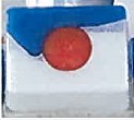
323 RB submitted that it (and previously RBA) has consistently over the years spent significant amounts on media advertising for the FINISH tablet products in Australia. The evidence showed that during the years 2018, 2019 and 2020, the sales of all FINISH gelcap products having a red, white and blue configuration of the 914 Mark accounted for a declining share of the market for FINISH products: approximately 30%, 24% and 10% respectively of all sales of Finish products in Australia.
324 RB contends that the image of its FINISH gelcap with its white, blue swirl and red ball was unique and had been for more than 10 years. RB provided the following examples of these depictions in the table below:
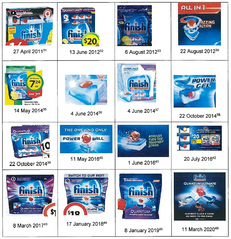
325 RB contends that ordinary or reasonable consumers familiar with the FINISH tablet products, and in particular those having previously used the FINISH Quantum or FINISH Quantum Ultimate products (which continue to be sold), will be likely to, in the hurried and cognitively overwhelming supermarket environment, view the SE Logo (whether on packaging, or on off-pack material such as aisle fins or wobblers) and be misled or deceived into thinking that the SE Gelcaps are, or are associated with, the FINISH products.
326 RB contends that the deception will not be neutralised by any of the other elements on the SOMAT packaging including:
(a) the word “SOMAT”, because the SOMAT brand is new to the market and consumers, unfamiliar with the brand are likely to give that word less attention; or
(b) the use of the colour red, because the variable use of colour by the FINISH brand means that consumers are likely to consider packaging colour to be less diagnostic.
327 Henkel contended that RB’s passing off and misleading and deceptive conduct allegations should be dismissed and gave two key reasons why the allegations should be rejected.
328 Henkel’s first reason was that RB did not enjoy any reputation or goodwill in the “Claimed Indicia”, being a red Powerball in combination with the colours blue and white, standing alone from the FINISH trade mark. Henkel made several propositions in support of this submission.
(a) First, there was no evidence that RB had ever used the Claimed Indicia on any product, packaging or marketing material, without the FINISH POWERBALL Logo — and therefore there was no secondary reputation in the Claimed Indicia alone.
(b) Second, RB had consistently and invariably made prominent use of the FINISH brand name; and it is that brand which is the strongest diagnostic cue for consumers (noting that, generally speaking, the brand name is the most diagnostic cue for identifying a preferred brand).
(c) Third, RB had not used the Claimed Indicia consistently. RB has over many years offered a range of dishwashing capsule products for sale, using a range of different colours (including green, silver and yellow); a range of different sub-brands and taglines, such as “Quantum”, “Powerball”, “All in 1” and “Classic”; and a range of different images (differently shaped and coloured product depictions). Henkel submitted that the evidence shows that RB has made substantial sales of dishwashing capsules which have not featured some or all of the Claimed Indicia. The only constant has been the consistent use of the FINISH POWERBALL Logo across all packaging and advertising.
(d) Fourth, the packaging of the FINISH products is very cluttered and features up to 18 visual elements. The cluttered nature of the packaging forces the consumer to rely on the FINISH POWERBALL Logo as the key defining element.
(e) Fifth, there has been extensive third party use of one or more of the Claimed Indicia. Henkel referred to the FAIRY Platinum Plus product, the highest selling of the FAIRY products, which features a predominantly white base, a blue wave form and the prominent use of a red coloured gel.
(f) Sixth, RB not entitled to any goodwill, by reason of the authorised use issues alleged, RB has not acquired any reputation or goodwill in the Claimed Indicia.
329 Henkel’s second reason as to why the claims for passing off and misleading or deceptive conduct should be dismissed is that the SE Gelcaps bear no resemblance to the FINISH tablets. Henkel gave several reasons in support of this submission.
(a) First, all the packaging and marketing materials relating to the SE Capsules prominently feature the distinctive brand name SOMAT. That brand name bears no resemblance to FINISH, or the FINISH POWERBALL Logo, and makes it clear that the SE Capsules are rival products being sold by a rival brand.
(b) Second, the SE Gelcap packaging consistently uses the dominant background colour of red, as does all the packaging of all the other products in the SOMAT range, so that when the SE Gelcaps are offered for sale on a supermarket shelf, they are amongst a sea of red packaging (see example image below).
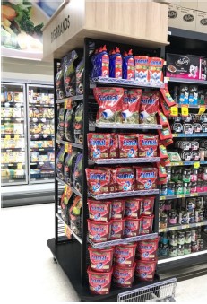
(c) Third, when viewing the packaging as a whole, the SE Gelcaps are readily distinguished from the Finish products: they do not use the FINISH logo, do not use blue, purple or green as a dominant background colour, and do not use the tagline “Powerball”. Henkel provided the following side by side comparison to illustrate this point.
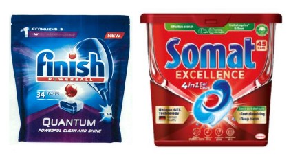
(d) Fourth, there are numerous differences between the product depictions on the packaging; and that the depiction of the SE Gelcap on the packaging is no closer to the FINISH depictions than the images on the FAIRY products.
(e) Fifth, the SE Gelcaps are displayed in a retail environment which makes it clear that they are the product of a rival brand. Henkel relied on the following image to demonstrate how products from the different brands are displayed in a supermarket:
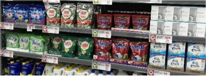
(f) Sixth, RB’s evidence (in particular that of Ms Sherry) failed to establish any risk of confusion. RB relied on two Henkel consumer research reports which evaluated consumer reactions to proposed Henkel television commercials. Henkel submits that these two reports provide no basis for confusion for several reasons: the reports are not evaluating consumer responses to SE Gelcaps but rather to the whole SOMAT range; the reports were prepared to evaluate the strength of three key advertising messages; and example responses relied on by Henkel that referred to FINISH demonstrated that there was an awareness that the SOMAT products were not affiliated with FINISH.
(g) Seventh, in a real world environment, a consumer would have to undertake a lengthy series of “unlikely steps” to mistakenly purchase a SOMAT product when intending to purchase a FINISH product. Given the very low risk of a consumer making each of the series of mistakes, there is no real risk or likelihood of deception.
(h) Eighth, RB’s reliance on a particular class of “forgetful shopper[s]” who remember the shape of the FINISH product but not the brand name FINISH does not assist any further in establishing any risk of deception.
Consideration
The class of consumers
330 First, it is necessary to identify the class of prospective consumer. In the present case the relevant class of consumers is the ordinary and reasonable consumer who owns an automatic dishwasher and who is looking to replenish their stock of dishwashing capsules.
331 Within the class from which the hypothetical individual consumer is drawn there will be members from the various sub-classes of consumer identified by RB and the expert evidence. I do not consider it appropriate to narrow the relevant class of consumer to any one of the subclasses such as the long-time purchaser of FINISH products or to the forgetful shopper.
332 RB’s submissions focussed on particular sub-classes of consumers. These subclasses included:
(a) “regular purchasers of FINISH tablet products”, as referred to in RB’s written submissions;
(b) “consumers who regularly use and handle the Finish Quantum and Finish Quantum Ultimate products” who would be “particularly familiar with the appearance of the products” (also referred to in written submissions);
333 As discussed above, the experts also identified several subclasses of consumer, including:
(a) Consumers who specifically want a variant of a FINISH product, for example a Quantum Ultimate Pro customer who does not want any other FINISH product, who will be least likely to be confused given their high level of involvement in the purchase;
(b) Consumers who are looking to buy a FINISH product but might select different variants based on pricing promotions (ie, will purchase a FINISH Quantum if it is on sale rather than a FINISH All in 1 Max);
(c) Consumers buying within a repertoire of familiar brands, who may be drawn towards selecting a product based on pricing promotions (ie, will select a FINISH or FAIRY product depending on which is on sale); and
(d) Consumers dubbed the “forgetful shopper”, being those who are looking to replenish the FINISH product they have at home and are unable to recall the brand name FINISH (even when in the supermarket when confronted with the display of products); but who know what the product looks like because they have often taken them out of the bag and put them in the dishwasher.
334 In cross-examination RB’s case appeared to narrow to the forgetful shopper.
335 Professor Klein did not consider the hypothetical “forgetful shopper” to be at all likely. She highlighted the improbability of consumers falling within this category in several responses, including:
Who doesn’t remember it’s Finish, who still doesn’t remember its Finish when they are standing there looking at all the Finish products, including products they’ve purchased many times.”
336 I accept Professor Klein’s evidence, especially with regard to the high number of errors a forgetful consumer would have to make before being mislead into purchasing a SOMAT product.
337 I do not agree that the representative class of consumers is to be narrowed in the manner suggested by RB. The appropriate class includes all classes of those shopping for automatic dishwashing products. As Deane and Fitzgerald JJ said in Taco Bell at 202 (quoting Puxu Pty Ltd v Parkdale Custom Built Furniture Pty Ltd (1980) 31 ALR 73 at 93):
[O]nce the relevant section of the public is established, the matter is to be considered by reference to all who come within it, “including the astute and the gullible, the intelligent and the not so intelligent, the well educated as well as the poorly educated, men and women of various ages pursuing a variety of vocations”.
338 It is not permissible to narrow the class of consumer to exclude a particular group, such as the well-educated to more readily define a class whose members may be more easily misled. All the members of the class will be looking to select a dishwashing tablet from the supermarket shelves, all are exposed to the SE Gelcaps and FINISH products, not just the forgetful shopper. RB seeks to define the class down to a small portion of the general class so as to carve out a class of consumer who may be more likely to be misled.
339 In my view it is inappropriate to narrow the class of consumers to only the forgetful shopper, or, conversely, those who always buy FINISH Quantum Ultimate Pro.
340 In a market which the experts described as being “brand driven” and in which there are currently two major players, three with the entry of the SOMAT brand, the forgetful shopper who cannot remember the brand of the dishwashing product they use regularly, even when confronted by supermarket shelves displaying the two (or three) brands is inherently unlikely and is not representative of the relevant class of consumer.
Distinctive components
341 RB’s passing off case as pleaded in paragraphs 10–11 in the Amended Statement of Claim is that RB has developed a valuable reputation and goodwill in the “distinctive components” of dishwashing products which were advertised and promoted by the use of a prominent depiction of the configuration and appearance of the product. The distinctive components as pleaded include:
(a) A red Powerball (which is to say, a convex circular element) prominently visible; and
(b) The combination of that red Powerball with the colours blue and white.
342 The indicia as pleaded is broader than just the appearance of the FINISH gelcap which was said to have a red white and blue colour in the configuration of the 914 Mark (the FINISH Quantum and FINISH Quantum Ultimate products).
343 RB’s written submissions acknowledged that the depictions of the FINISH capsule products on the FINISH packaging over the years have been in a variety of forms (all said to be unique to the FINISH brand) of a blue and white rectangular tablet or capsule with a red centred spherical or circular element. The range of variety can be seen in the sixteen example products below which were relied on in RB’s submissions. Each example tablet was said by RB to have a red circular element, with a blue and white rectangular tablet or gelcap. Some examples are gelcaps with the blue wave form, others are hard tablets with equal amounts of blue and white (top blue, bottom white). Another is a white pouch and a blue pouch separated by a red ball. At least three different versions of FINISH capsules were pictured:

344 It must also be recalled that there was further variety in the FINISH products in addition to the different combinations of white, blue and red, with some FINISH capsules having the colours yellow or green instead of the blue section, and some being capsules rather than tablets or gelcaps. As at the date of launch of the SE Gelcaps, RB offered for sale a variety of FINISH capsules, many of which were not the gelcap, or even involved the colours red, white and blue.
345 The one constant in the FINISH capsules as depicted on the packaging is the existence of a red circular element: a sphere (or part thereof) or a circle. But RB did not plead a reputation for the purposes of passing off in just the red Powerball.
346 RB’s written closing submissions focused on the FINISH gel cap pictured below which it said had a red, white and blue configuration of the 914 Mark. During cross-examination of Professor Klein, RB’s senior counsel described the relevant FINISH product as “a predominantly white tablet with a red circular element and a blue wave like shape”.
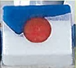
347 RB’s sales figures showed that products using the wave form in the 914 Mark accounted for only a small fraction (approximately 10%) of all the FINISH dishwashing capsules sold in Australia in 2020.
348 RB’s passing off and misleading and deceptive conduct cases depend upon a narrow class of consumer: the forgetful shopper.
349 As I have said earlier, I consider that the class of consumers is broader than the forgetful shopper. I do not consider the forgetful shopper to be the hypothetical representative of the reasonable consumer for the purposes of considering whether there has been any misrepresentation. On RB’s case, the forgetful shopper is looking for a predominantly white tablet with a blue wave form and red circular element, like the configuration of the 914 Mark. As at the date of the SOMAT launch, only 10% of all FINISH dishwashing capsule sales were gelcaps in the form of the 914 Mark. Not every purchaser of FINISH capsules will be a forgetful shopper. To the contrary, I consider that only a tiny fraction of the 10% of FINISH dishwashing capsule purchasers who are gelcap consumers are likely to be “forgetful shoppers”. That is in no way representative of the broader class of consumer that is appropriate in this case: the consumer who owns an automatic dishwasher, who may know the main brands in the market, and wants to replace their stock of dishwashing capsules.
Reputation
350 I do not consider that RB has acquired a reputation in the Claimed Indicia sufficient to found a claim in passing off. I make that finding whether the Claimed Indicia is the red Powerball in combination with the colours white and blue, or the narrower form: a predominantly white tablet, with a blue wave form and red circular element (or 914 Mark gelcap), for the following reasons.
351 There was no evidence RB had ever used the Distinctive Components (of any kind) on packaging of dishwashing products on its own, without the FINISH POWERBALL Logo also being prominently displayed. The actual use of the FINISH POWERBALL Logo and the Claimed Indicia makes it less likely for the Claimed Indicia to have acquired a secondary meaning: see eg Telstra Corp Ltd v Phone Directories Co Pty Ltd (2014) 107 IPR 333 at [479]; Stone & Wood at [208].
352 I do not consider the images of the Quantum Ultimate Products in the television commercials discussed above change that, as they are only fleetingly visible during a moment of the animated sequence of the television commercial. The FINISH POWERBALL Logo is prominently used in each of the commercials.
353 RB has not consistently applied the Distinctive Components to its dishwashing products or the packaging in which they are contained. The FINISH capsule range includes products of varying colour combinations (such as white and yellow or white and green) and varying shapes (ie, some capsules have the blue section layered on top of the white; some have the white and blue side by side; some have the wave form).
354 The substantial bulk of RB’s sales (around 90%) are for FINISH capsules other than the gelcap which do not include each of the Distinctive Components.
355 Professor O’Sullivan and Professor Klein agreed that the colours vary in the packaging of the FINISH capsule range reducing its usefulness as a diagnostic cue. Likewise variation in the colour of the capsules would be expected to reduce the ability of the Distinctive Components to be a useful diagnostic cue to consumers.
356 The FINISH capsule packaging is very cluttered with up to 18 visual features. Varying stylised depictions of the products does not stand out as much as the well-known and consistently applied FINISH POWERBALL Logo. This part of the packaging is one aspect that has been consistently applied to packaging and advertising for many years.
357 The colours red, blue and white are not limited to the FINISH capsules. FAIRY also uses white, blue and red on its capsules, including in a blue wave in its highest selling FAIRY Platinum Plus capsules.
358 I accept that RB may have a reputation in the red Powerball, as it is the one constant on the FINISH capsule packaging aside from the FINISH POWERBALL Logo, although there is variation in the depiction of the red ball in respect of its relationship with the tablet or capsule — whether it is embedded in the capsule or floating above. However, the red Powerball is but one part of the Distinctive Components relied upon by RB.
Misrepresentation or misleading conduct
359 Even if I were to accept that RB has established a reputation in the gelcap, or relied on the red Powerball alone, in my view, for the reasons that follow, RB has not established that Henkel has engaged in misleading or deceptive conduct, or conduct likely to mislead or deceive, or made false representations, in contravention of ss 18 and 29 of the ACL, nor engaged in passing off.
360 The experts agreed that consumers of low involvement products such as dishwashing tablets use least cues possible, usually only one or two cues.
361 Professor O’Sullivan agreed that the dishwashing capsules was a brand dominated sector, in which the two major brands had around 90% of the total dishwashing capsule market.
362 Given this small number of brands, and the possibility of a third entering the market in SOMAT, consumers are confronted with many stylised images. Brand would remain a good diagnostic cue. I do not accept that a consumer would elevate the importance of the product image over that of the brand.
363 As discussed earlier in the context of trademark infringement, the FINISH POWERBALL Logo is used on all FINISH dishwashing capsule products in the market — and is likely to be the most diagnostic cue for customers. The product images are not consistent across the FINISH range and vary with the varieties, rendering the image less diagnostic.
364 Professor O’Sullivan’s evidence focussed primarily on the use of the red Powerball, which may be consistent on FINISH packaging, but it is the red ball in combination with the blue and white wave form tablet (as in the 914 Mark) which is claimed as the distinctive components. Further, Professor O’Sullivan and Professor Klein agreed there are variances in how the red Powerball is displayed in relation to the capsules.
365 The two major brand dishwashing capsule products are stocked in the same area in the supermarket. The products of each brand are stacked together on the supermarket shelves. Consumers are familiar with seeing the two major competing brands next to each other on supermarket shelves. The photos of supermarket shelves in evidence show the SOMAT products occupying comparable shelf space to FAIRY. The arrival of another brand occupying a similar shelf area to one of the major existing brands suggest to the reasonable consumer that another major player has entered the market.
366 The packaging of each of the two major brands, and the SOMAT packaging, is very cluttered with up to 18 different visual cues, many of which, including the stylised depiction of the product, are common to the trade. One of the few things to stand out from the packaging to a consumer looking at a dizzying array of packages is the brand. The cluttered nature of the packaging forces the consumer to look at the brand. The brand is consistent for each brand variety, whereas the stylised image under the brand varies with variety.
367 The name SOMAT and the red background colour clearly differentiate those products from the FINISH products. Red and gold is not a colour combination used before in the sector.
368 In the case of FINISH and FAIRY, the stylised images are never seen without the prominent brand. Consumers would be aware that the stylised image is never seen without brand.
369 The stylised images of all brands are broadly similar: some configuration of a dishwashing tablet or capsule. The consumer needs to look closely to differentiate between the stylised images. I do not consider that a consumer would scan the various stylised images available in preference to looking for the prominent brand first. It is not a situation where only one brand has one image. There are at least 11 different images for a consumer to scan, if they are going solely by image. In contrast there are only two major brands, or three including SOMAT.
370 Consumers are unlikely to mistake the SOMAT brand as sub-brand of FINISH, or be misled that the SE Gelcaps are made by RB, or associated with RB.
371 The SE Gelcaps are different to the FINISH Gelcap, as I explained above in the context of the 914 Mark. Additionally, the overall packaging is different, with the SE Gelcaps sold in red tubs with gold lettering and the distinctive SOMAT brand which bears no similarity to the FINISH brand name. As Henkel submits, there is “virtually no visual connection between the two brands”.
372 I consider that even the hypothetical forgetful shopper is very unlikely to be misled.
373 The cross-examination of Ms Sherry as to isolated comments contained in consumer research obtained by Henkel in the UK and Australia is not of assistance.
374 The consumer research sought to evaluate consumer reactions to proposed 15-second television commercials for SOMAT.
375 The research reports were not concerned with evaluating consumer responses to SE Gelcaps. Rather, the focus of the reports was evaluating the performance of the commercials against three key marketing messages, concerning the broader SOMAT brand and range of products.
376 The Court was taken to five particular focus group responses which RB contended demonstrated that the SE Gelcaps were visually similar to a FINISH product, thereby creating a risk of confusion.
377 One of those responses, from a somewhat xenophobic focus group participant (out of 150) in the UK was as follows: "I really disliked the name of the product. It seems like an Asian name. Therefore a cheaper, inferior product. And because the ad was exactly the same as a Finish ad same blue and red detergent capsule thing, it seems like the company is ripping of Finish". This response, and others like it, do not assist RB. On the contrary, to the extent that it can demonstrate anything, it shows that consumers are not confused as they recognise that it is not a FINISH product.
378 A further reason why this kind of evidence does not go to establishing the risk of confusion is that there is no indication of which FINISH product the responses are referring to. No participant identified a predominantly white tablet with a blue wave form and red circle. That configuration, or the 914 Mark, is a small portion of sales. Consumers could have been referring to other FINISH products. Additionally, given the dominance of the FINISH brand on the market, it is perhaps expected that consumers would give feedback on a new product with reference to known existing brands.
379 The brand names are prominently displayed on every package, and the SOMAT packaging has a red background with gold writing, neither used in the FINISH repertoire. In my view there is no real likelihood of confusion, let alone confusion to the extent of being misled or deceived as to any association between the SE Gelcaps and the FINISH capsules.
Biodegradability representation
380 Prior to 3 September 2021, the SE Gelcaps were offered for sale in packaging that bore the following green device (the Biodegradability Device):

381 The Biodegradability Device included text reading “biodegradable” at the top of the circle and “100% water-soluble film” at the bottom of the circle, in what can only be described as very small font. The text was white against a green background. The Biodegradability Device appeared on the top right of both kinds of SE Gelcap packaging: the foil bag and the plastic tub. The device was about the size of a 10c piece on the foil bags and a 5c piece on the tubs.
382 A smaller version of the Biodegradability Device is also found on the side of the tub, and on the back of the foil bag. In both cases, the device is part of a green coloured panel of four “environmental” call outs. In this form the wording is beside the circle containing the image and reads “Biodegradable and 100% water-soluble film”.
383 Since 3 September 2021, the text of the Biodegradability Device on the packaging of the SE Gelcaps has been altered to read “biodegradable film” and “100% water-soluble film”.
384 RB contends that the SE Gelcaps are sold and promoted to retailers and consumers by reference to the Biodegradability Device, and that by doing so, Henkel has represented to consumers that the SE Gelcap is wholly biodegradable (Biodegradability Representation).
385 RB submits that the Biodegradability Representation is false because the SE Gelcaps include several ingredients that it says are not biodegradable including perfumes and dyes. As a result, RB submits that Henkel has engaged in misleading and deceptive conduct in contravention of s 18(1) of the ACL, and made false and misleading representations that the SE Gelcaps are of a particular standard, quality or composition, or have particular performance characteristics in contravention of s 29(1)(a) and (g) of the ACL.
386 Henkel denied that it had made the representation alleged, for reasons that I shall discuss shortly. Henkel admits that it has represented to consumers that the film that encapsulates the SE capsules is biodegradable.
387 Henkel says that many of the substances from which the SE Gelcaps are composed are biodegradable, but it accepts that if (which it denied) the Biodegradability Device (prior to amendment) conveyed the Biodegradability Representation, then that representation would be incorrect.
388 In any event, Henkel has, without admission, since the injunction hearing taken steps to amend the Biodegradability Device in the manner set out above. Henkel proffered an undertaking to the Court that it would not use the unamended Biodegradability Device on SE Gelcaps again, unless the facts change and the product as a whole is capable of being described as biodegradable.
389 Henkel submits that the Biodegradability Representation allegations should be rejected for four reasons.
390 First, when the Biodegradability Device is read as a whole, it clearly states “biodegradable 100% water-soluble film”: a representation that the film, in which the SE Gelcaps are wrapped, is biodegradable. Henkel contends this representation is true.
391 Second, the Biodegradability Device does not state that the whole of the SE Gelcaps are biodegradable. Henkel submits that the Biodegradability Representation could only conceivable arise if the consumer confined their attention to the top half of the Biodegradability Device, ignoring the text on the bottom half. Henkel submits that such an analysis would be erroneous as the bottom half is just a prominent as the top half, and the entire representation in question should be considered.
392 Third, the Biodegradability device would be read and understood by the ordinary and reasonable consumer in the context of the SE Gelcap packaging as a whole. The packaging states on the back (and the tub on the side) “Biodegradable and 100% water-soluble film”. In the case of the SE Gelcap packaging, this statement is repeated on the foil sealing the tub closed, albeit that this would not be able to be seen by a purchaser until after purchase.
393 Fourth, Henkel has voluntarily and without admission, taken steps to amend the device in the way described above. The amended text makes it abundantly clear that the biodegradability representation concerns the SE Gelcap film, and not the entirety of the SE Gelcaps.
394 The importance of this issue in the context of the proceeding can be seen from the fact that RB devoted two paragraphs in its written closing submissions to the issue.
395 There was no evidence as to how environmental factors such as biodegradability might influence the relevant class of consumer.
396 The SE Gelcap packaging is cluttered with visual features, many of which are circles or boxes containing text such as “unique GEL Technology” or “even in eco & short cycles”. The Biodegradability Device is just one of the 16 visual features on the front of the packaging, which include the SOMAT brand and the red background.
397 As previously discussed, the SE Gelcaps are a low involvement product where consumers take a matter of seconds to select the product that they are to purchase, relying on one or two visual cues to do so.
398 In the circumstances where the SE Gelcaps are a low involvement product where consumers take a matter of seconds to select the product that they are to purchase, consumers are very unlikely to pick up the packages off the shelf to examine them, and read the many epithets and shout outs on the packaging in detail. The small size of the Biodegradability Device makes it unlikely that any consumers would be able to read the words contained in the circle without picking up and closely examining the packaging.
399 Those consumers who were minded to pick up and examine the SE Gelcap packaging, would be expected to examine the packaging fully, and not just limit their examination to the front of the packaging. These consumers would also see as part of their examination the Biodegradability Device on the back, or tin foil in the tub, and would not be misled or deceived that the capsule, rather than just the film, was biodegradable.
400 The Biodegradability Representation misleading and deceptive conduct case must fail.
CONCLUSION
401 RB has failed on its infringement case. The SE Logo does not infringe either the 914 Mark or the 311 Mark.
402 RB has also failed on its passing off and misleading and deceptive conduct cases.
403 Henkel has succeeded on its cross-claim. RB has not used the 914 Mark or the 311 Mark over the relevant period. I will not exercise my discretion to permit the 914 Mark and the 311 Mark to remain on the Register.
404 I will hear further from the parties concerning orders to give effect to these reasons.
I certify that the preceding four hundred and four (404) numbered paragraphs are a true copy of the Reasons for Judgment of the Honourable Justice Rofe. |
Associate:
Dated: 6 September 2022